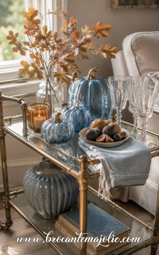
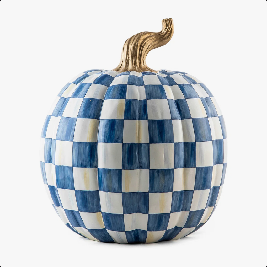
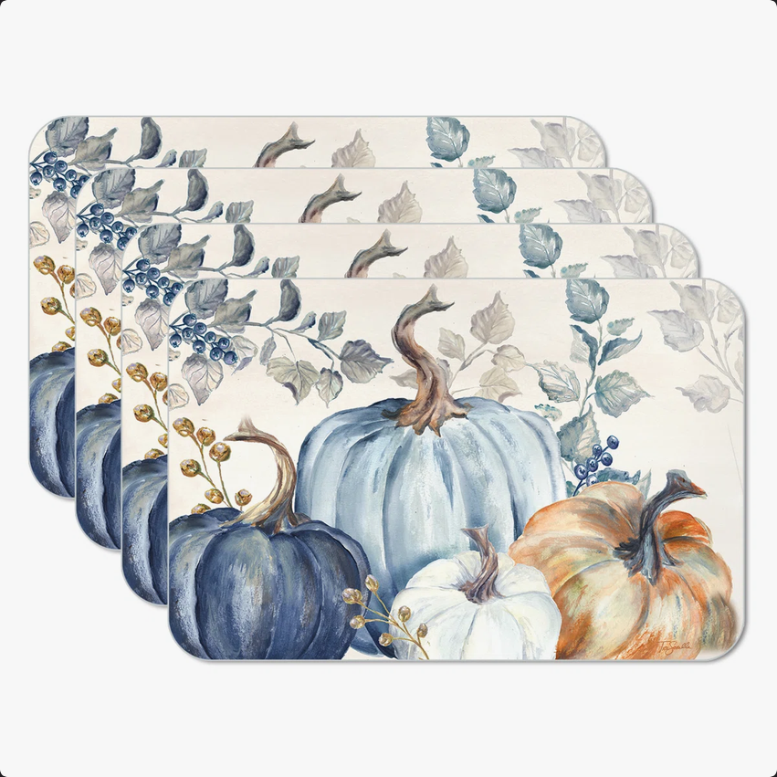
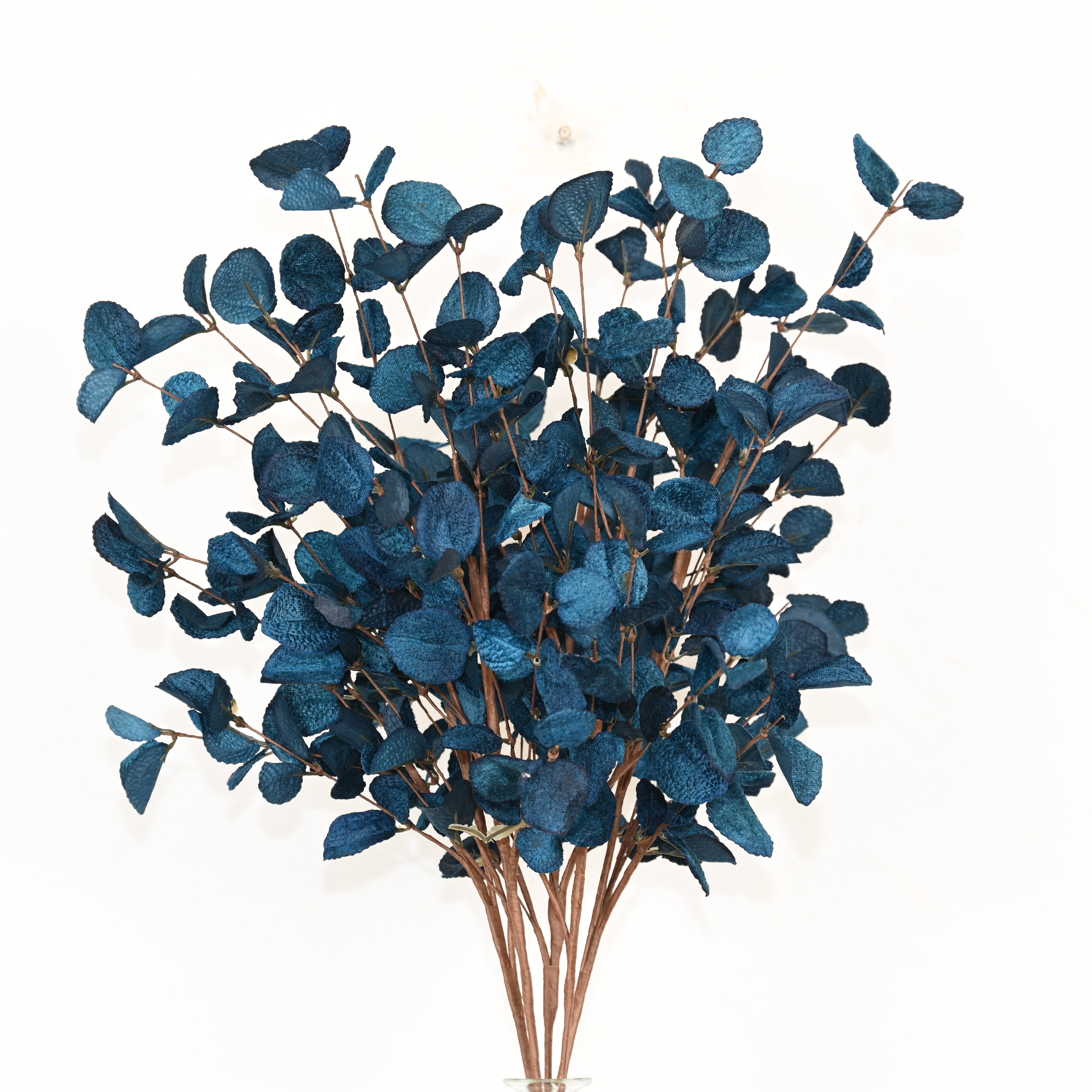
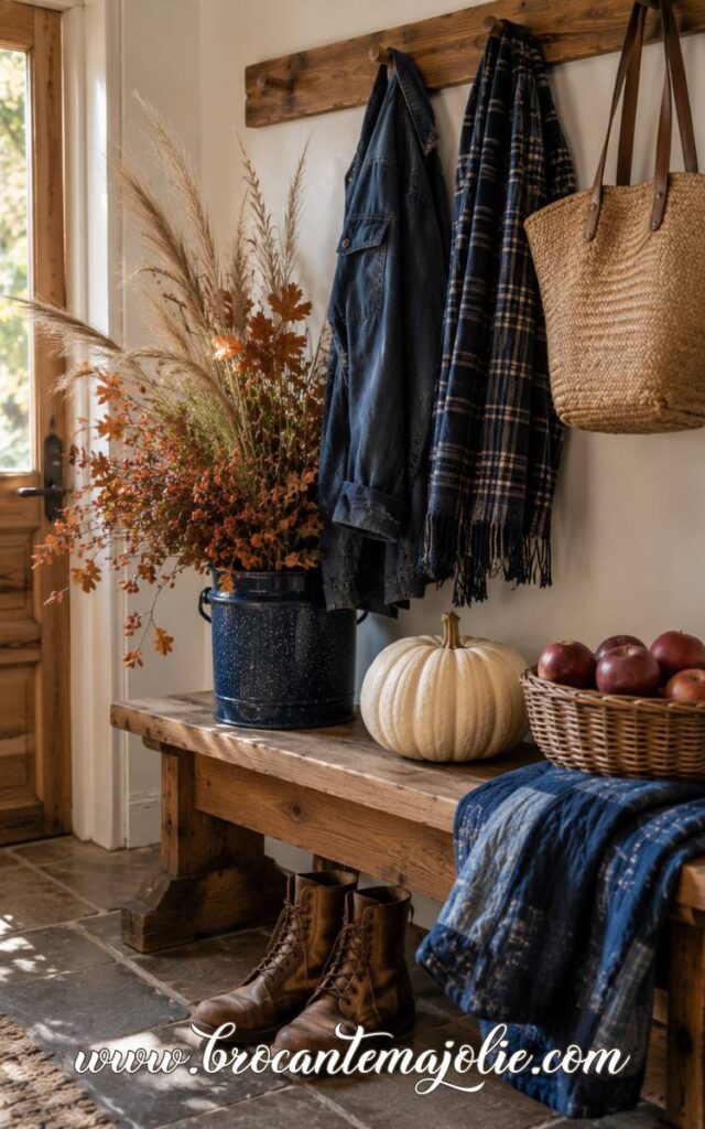
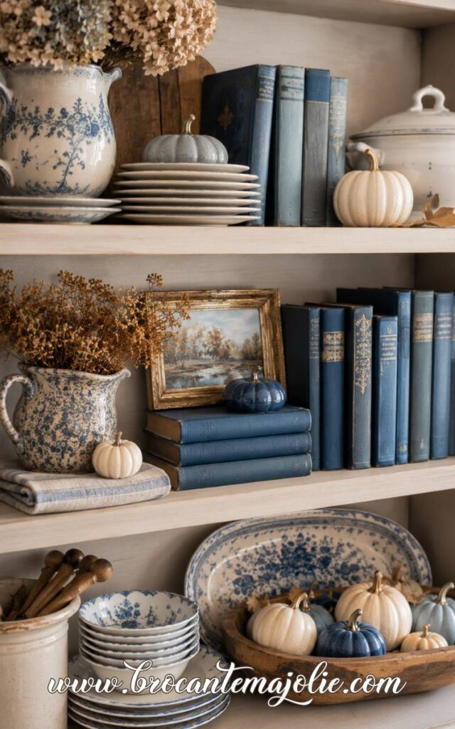
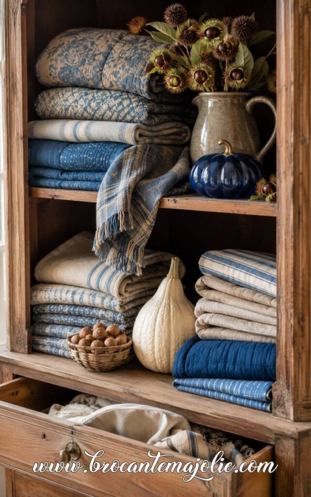
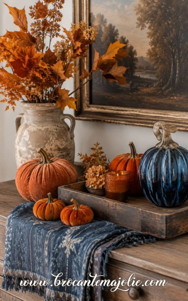
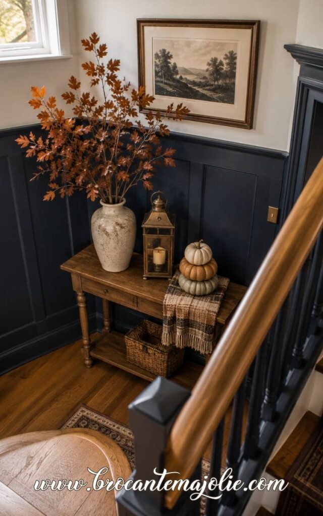
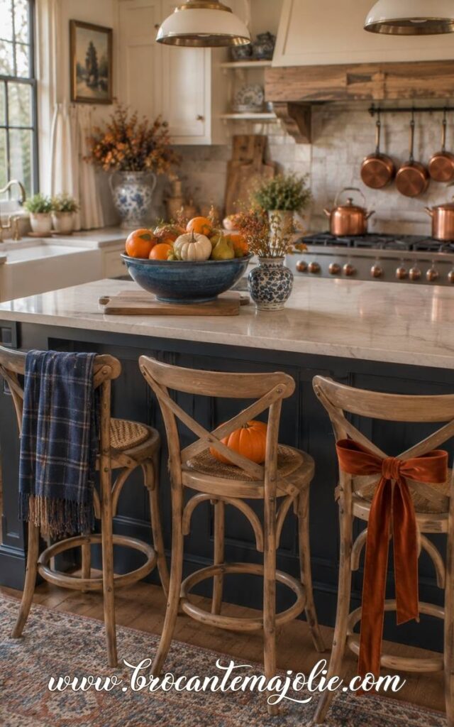
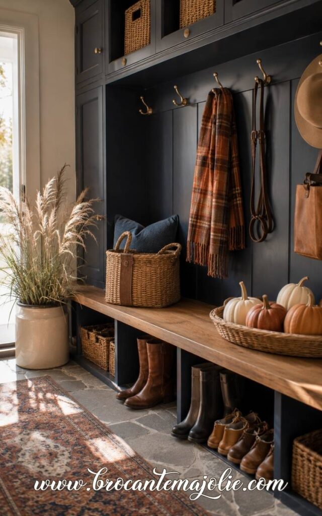
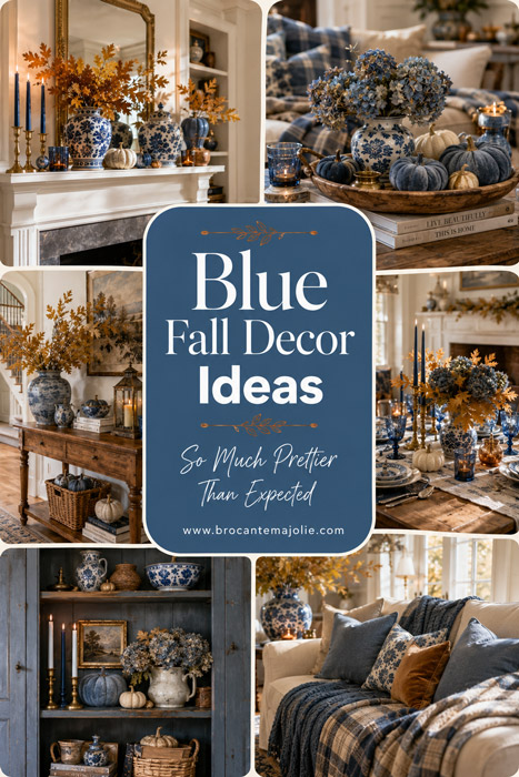
Blue fall decor may not be the first thing that comes to mind when autumn arrives, but I find it much easier to live with than a room filled only with orange and brown.
Blue already exists in so many homes through a couch, a rug, curtains, or a few pillows.
Instead of hiding those pieces for fall, I prefer to work with them.
The color also changes so much depending on what you pair with it.
Blue and orange feels warm and classic.
Blue and green is softer and more natural.
Pink and blue feels feminine.
While purple and blue creates a deeper and more unusual color scheme.
This article is really about finding the combination that suits your taste.
Let’s begin!
Blue Fall Decor
I have provided a direct paid link wherever possible so that you can easily shop and decorate.
Table of Contents
I. Blue Fall Decor Ideas for a Softer Autumn Home
Blue fall decor works best when the blue already feels connected to the home.
You may have a navy pillow, a faded blue rug, a blue plaid throw, or a favorite piece of pottery that stays out all year.
I would start there, then bring in the warmer materials that make the color feel right for autumn: wood, velvet, wool, brass, dried leaves, candles, and pumpkins.
Blue does not need to replace the traditional fall colors.
It can simply give them a calmer background.
Start With the Blue Accents You Already Own
Before buying new decorations, look at the shade of blue already in the room.
A cool blue looks natural with white, sage, and eucalyptus.
A warmer denim blue sits beautifully beside rust, terracotta, and amber glass.
Once you know which blue you are working with, the rest of the color palette becomes much easier to choose.
You do not have to repeat the exact same shade everywhere.
A room often feels more natural with several related blues.
Add Blue Pumpkins and Seasonal Decorations
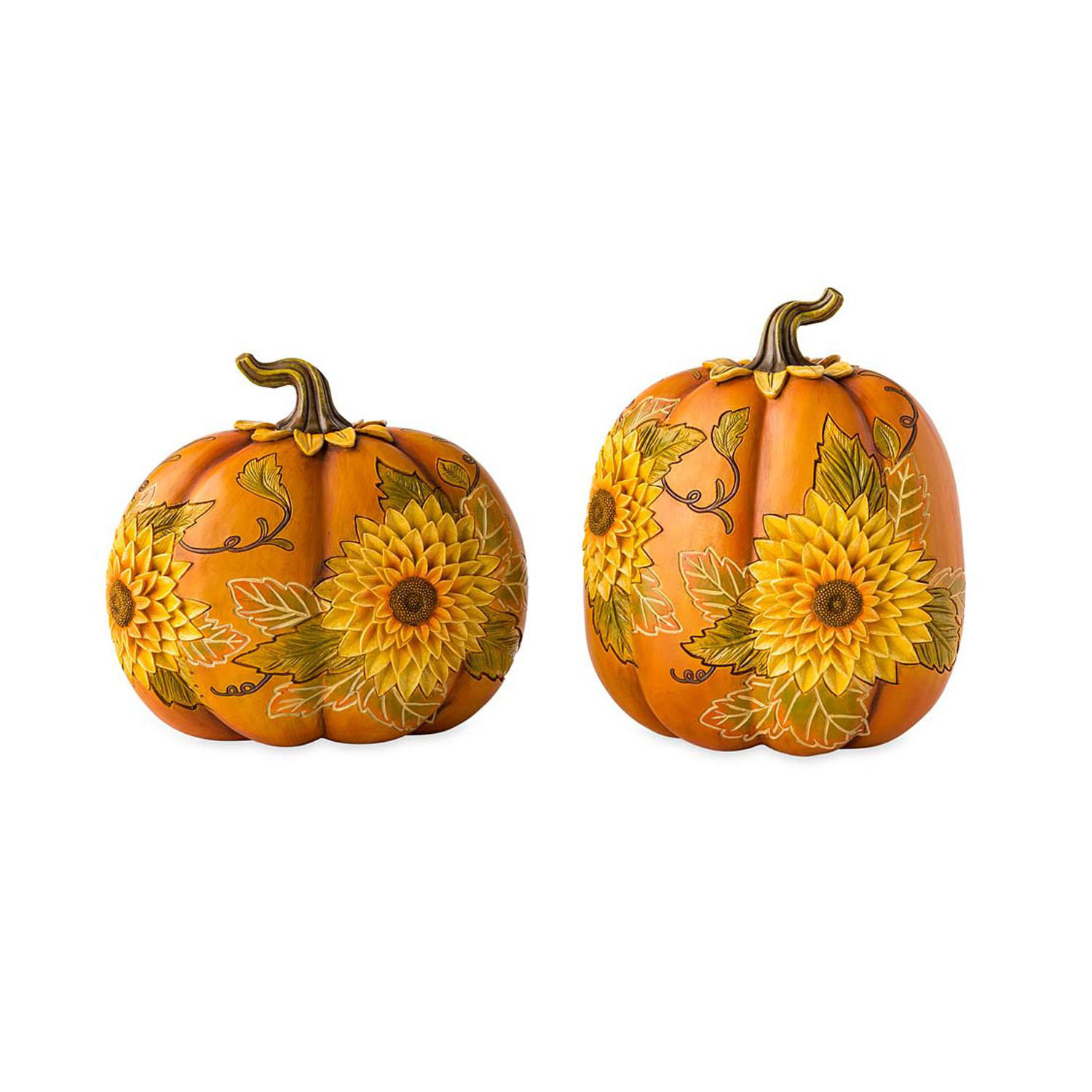
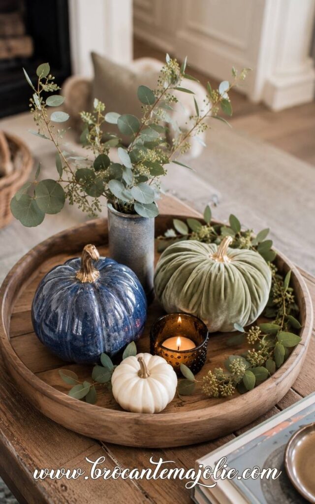
Pumpkins make blue feel unmistakably autumnal.
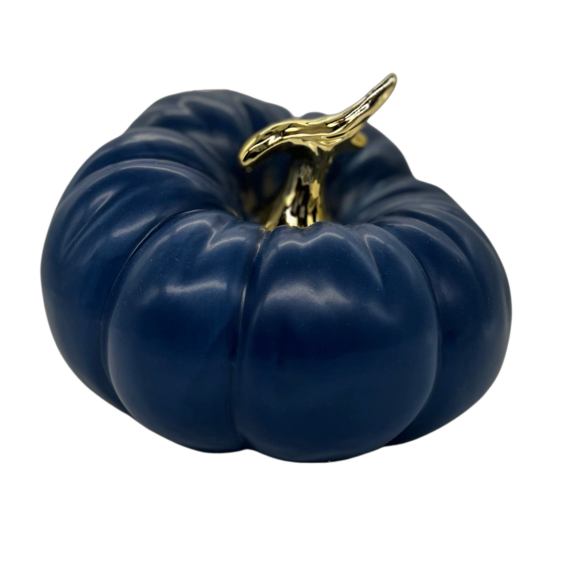
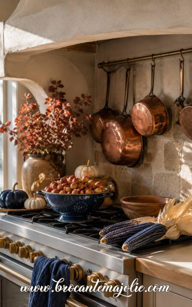
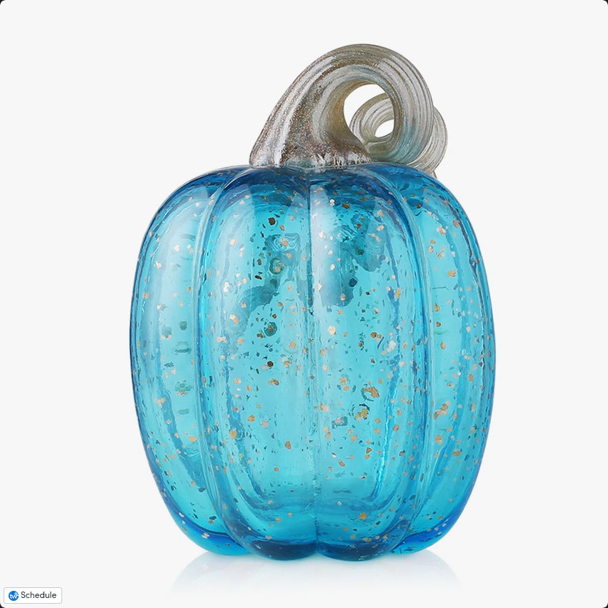
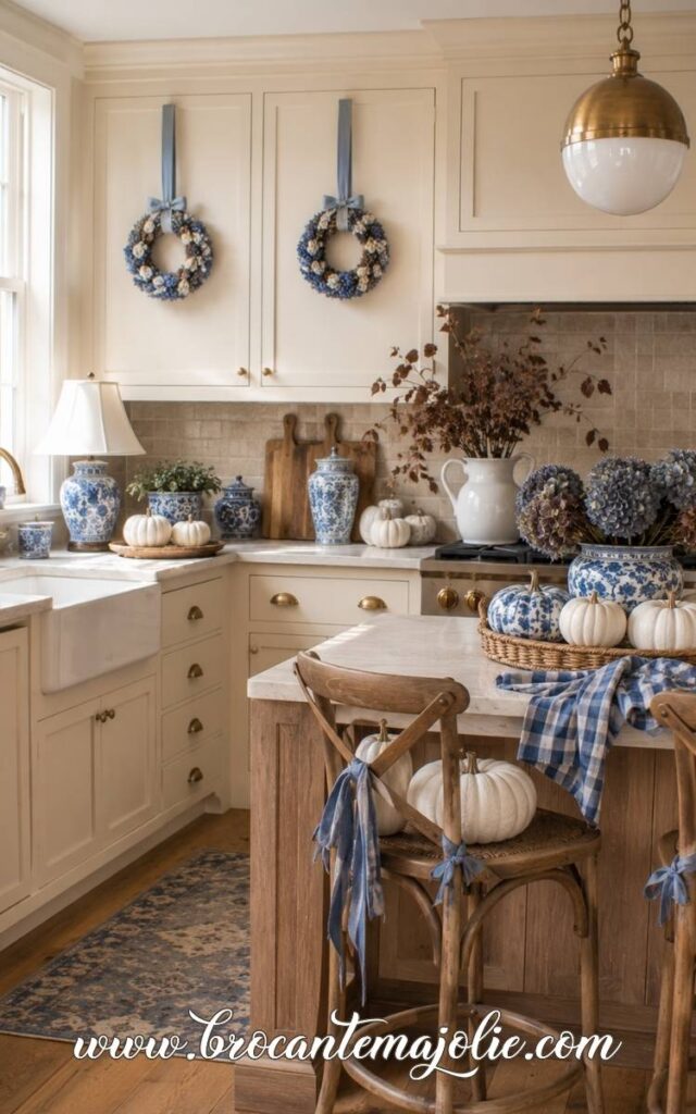
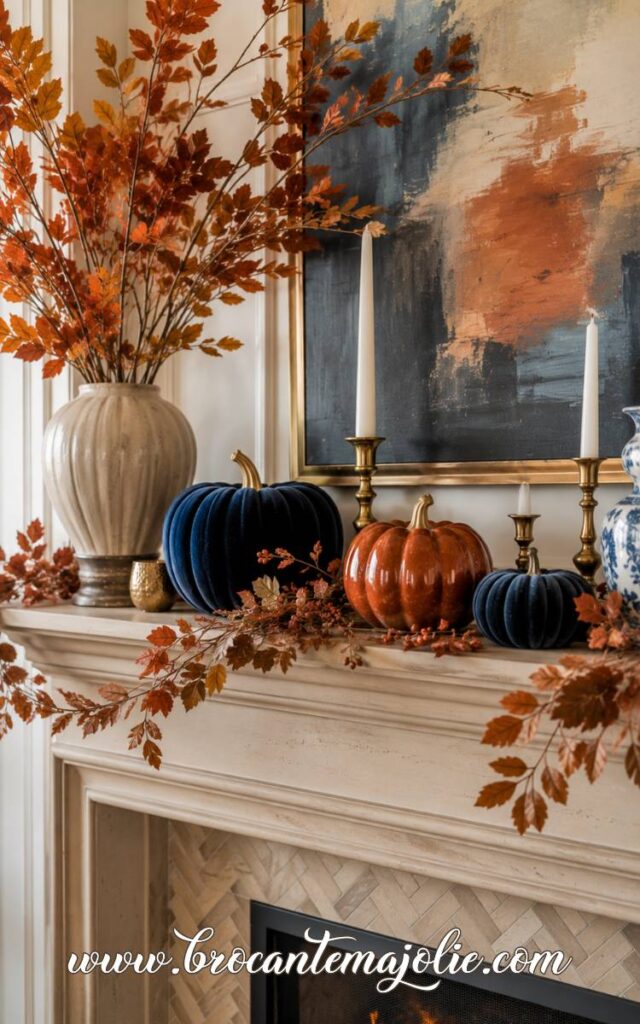
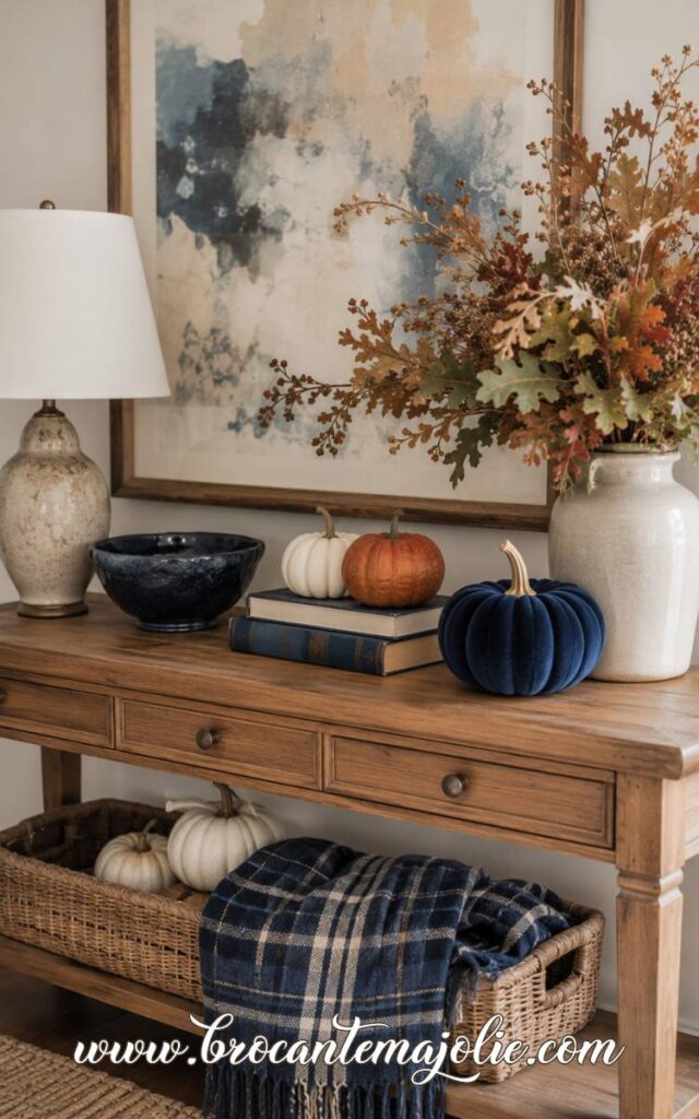
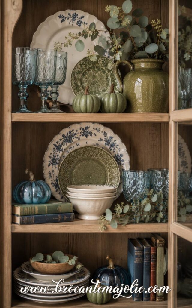
A few blue pumpkins can sit on a mantel, coffee table, bookshelf or kitchen island.
I would mix them with at least one warmer or more natural material.
They also do not all need to match.
Other blue fall decorations can be very simple: a plaid ribbon tied around a wreath, a blue ceramic bowl filled with mini pumpkins, or a block-printed textile folded beneath a centerpiece.
Style the Couch With Blue Fall Accents
The couch is a good place to establish the main color scheme, especially if it takes up a large part of the room.
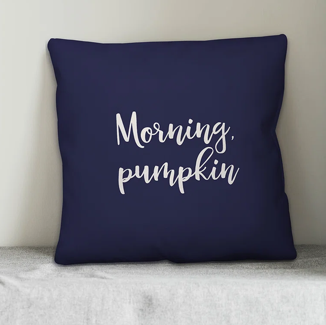
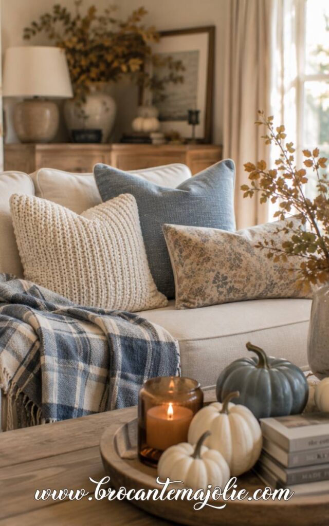
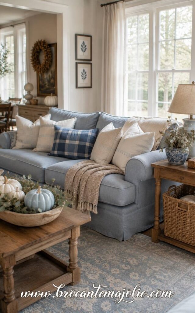
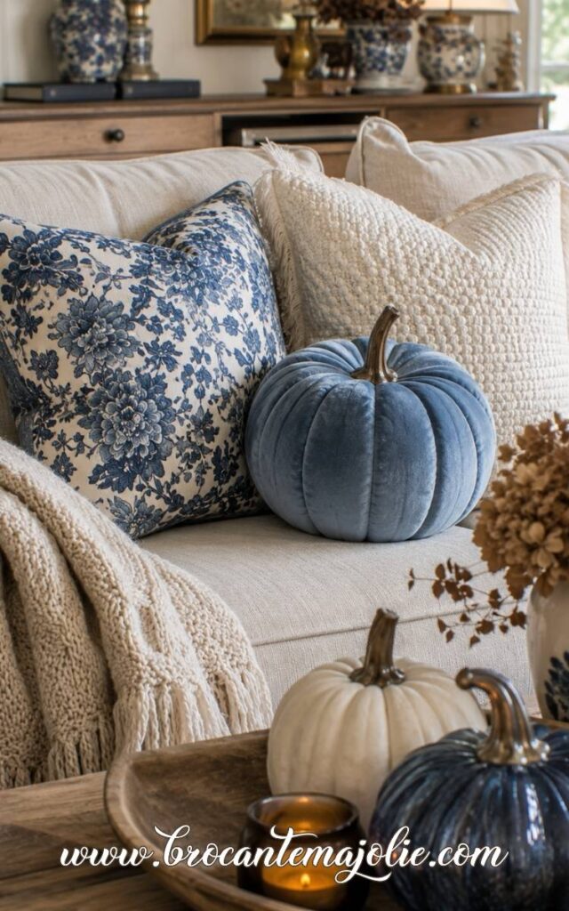
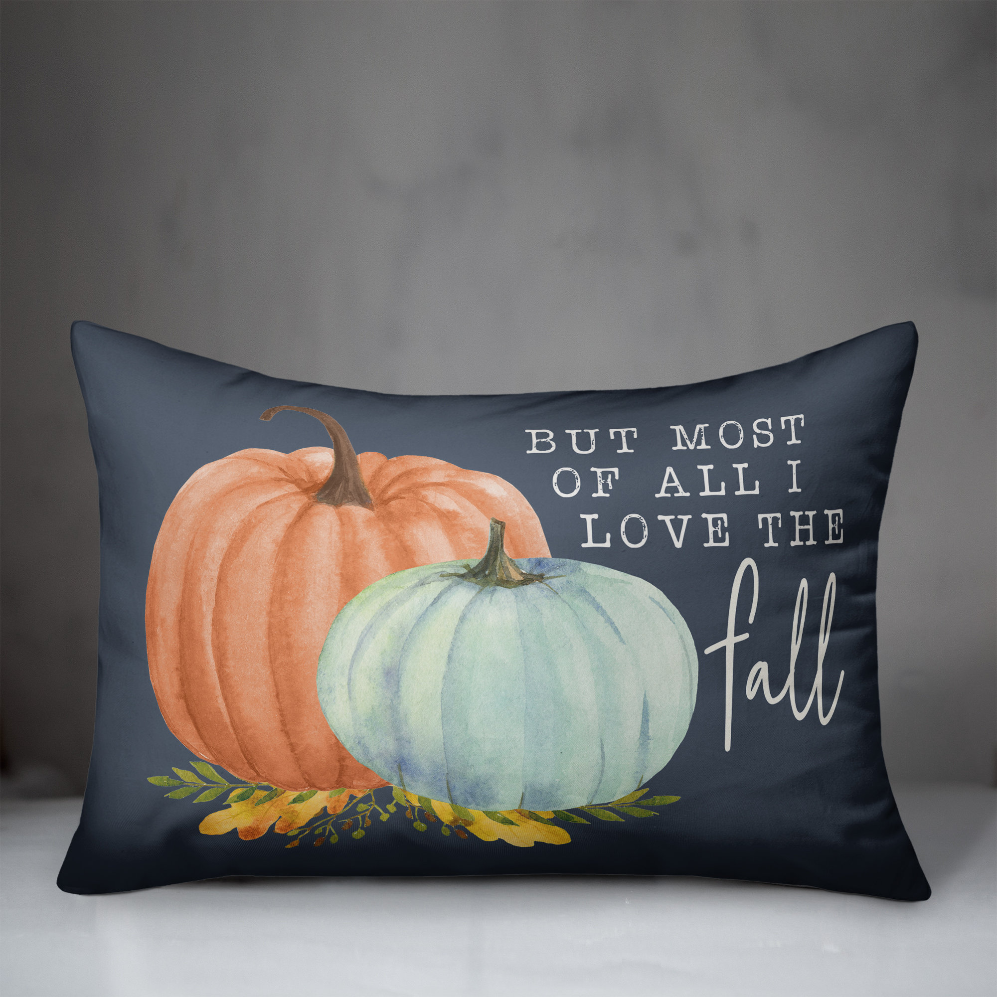
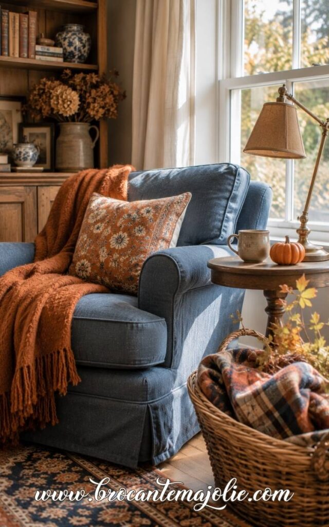
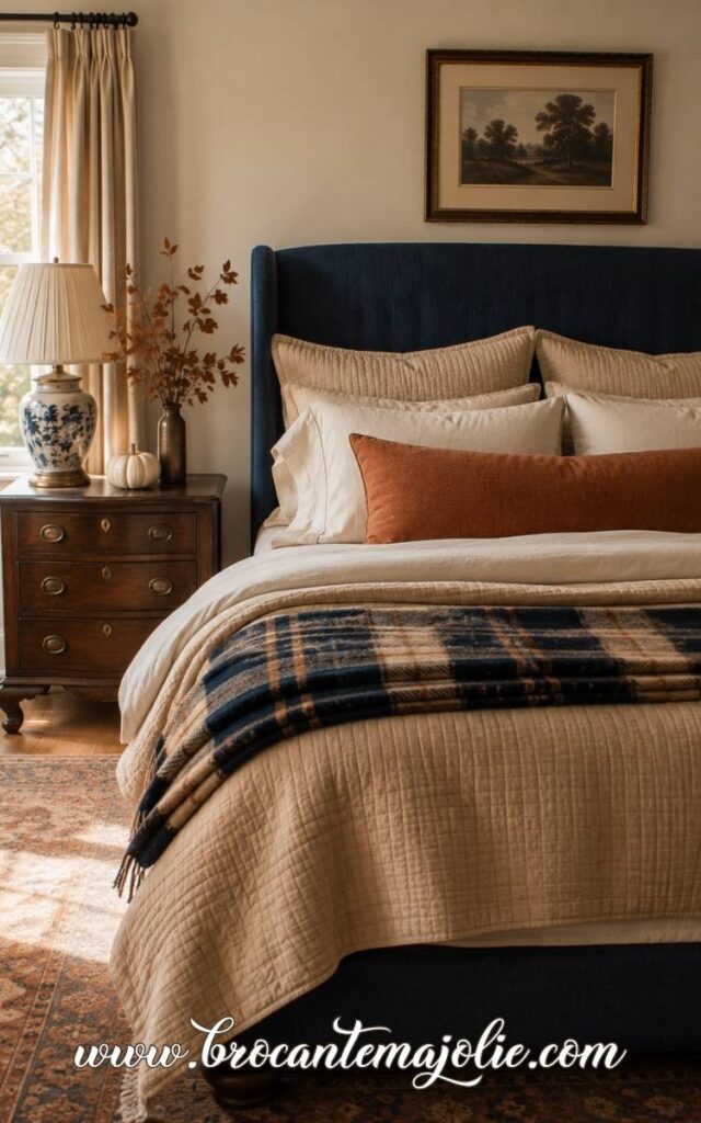
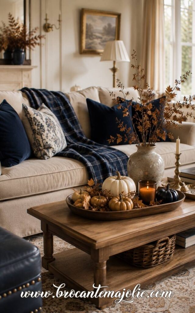
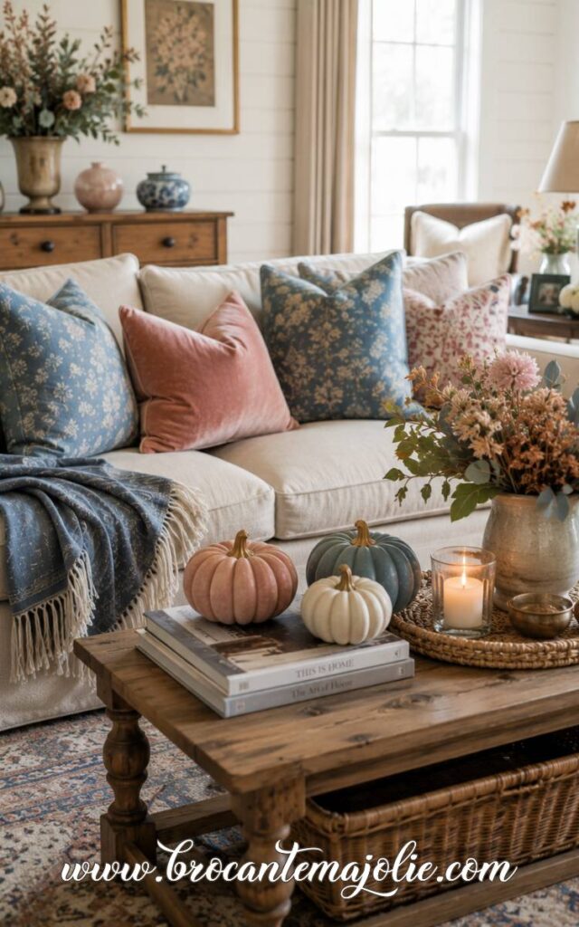
On a neutral couch, try one navy or faded blue pillow with something warmer beside it.
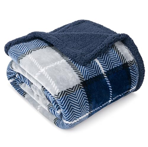
A blue plaid throw is another easy addition.
The pattern brings in more than one color, which makes it easier to connect the couch to the pumpkins, wood tones, and autumn branches elsewhere in the room.
If the couch itself is blue, I would not cover it with more blue cushions.
Let the sofa be the main blue element, then add warm accents through rust pillows, cream throws, brown leather, amber glass, or natural wood.
The room should still have contrast.
That is what stops a blue autumn palette from feeling cold.
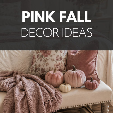
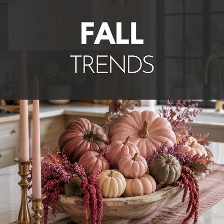
If orange is not really your color, pink fall decor might be the softer seasonal palette you did not know you needed.
Repeat Blue in the Wreath and Centerpiece
Repeating the blue once or twice beyond the couch makes the room feel connected.
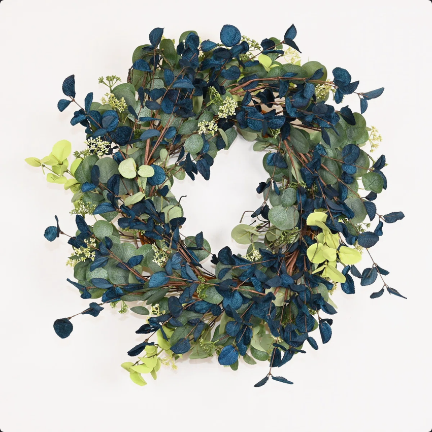
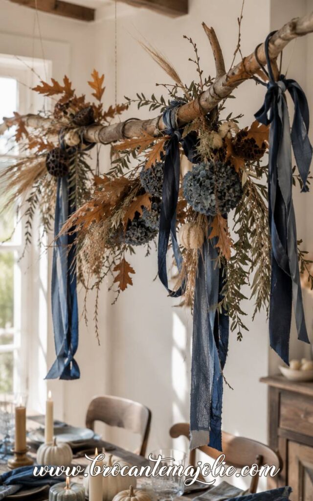
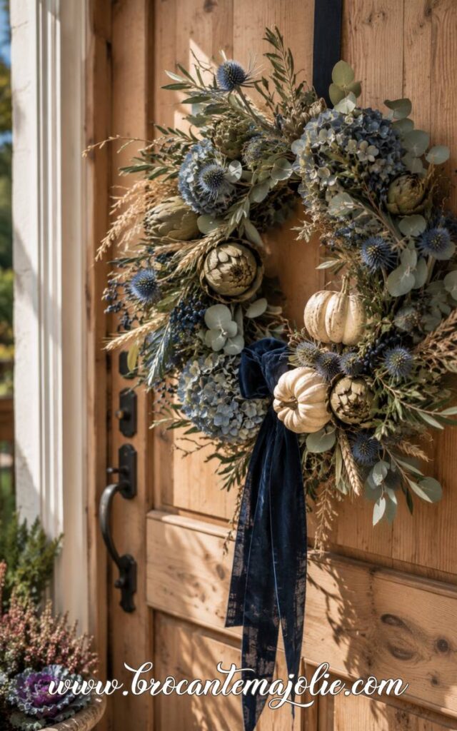
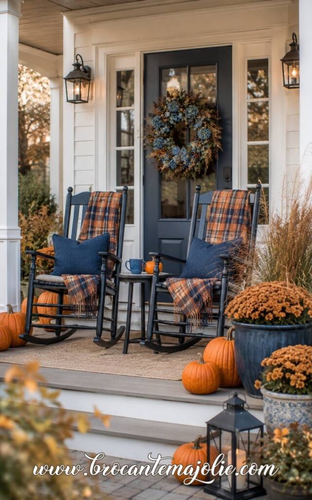
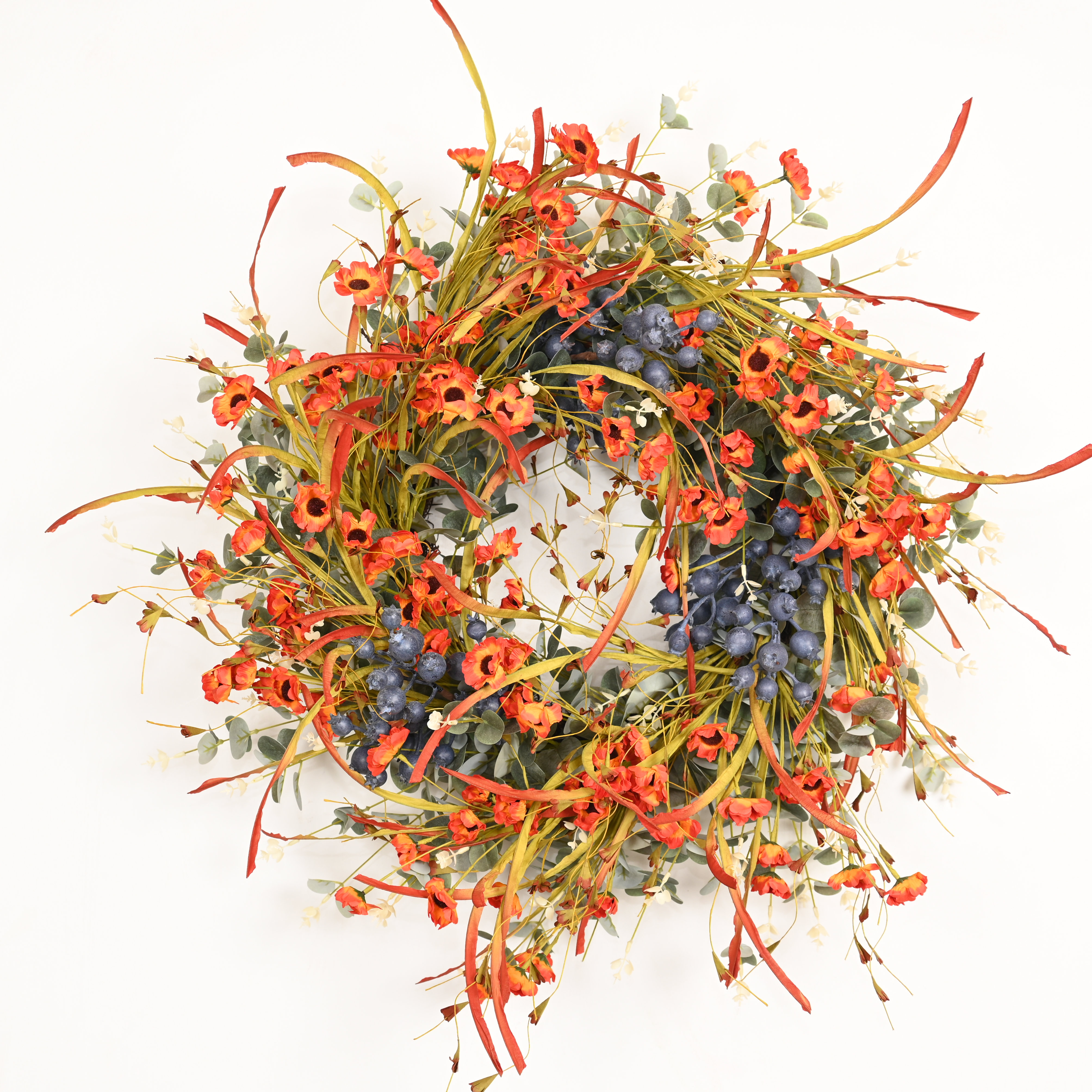
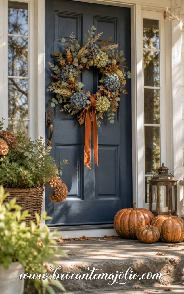
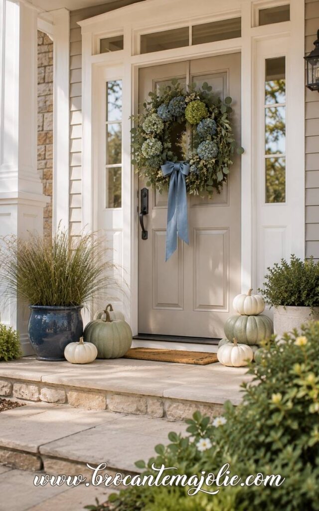
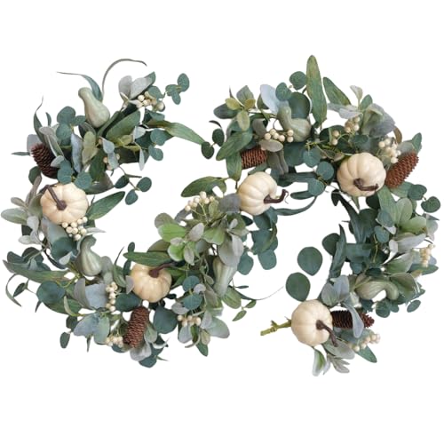
A fall wreath might include faded blue hydrangeas, dark berries, eucalyptus, wheat, or a navy ribbon. It does not need to be completely blue.
One clear blue detail is usually enough to relate it to the rest of the home.
For centerpieces, I like using blue in the container or one of the seasonal elements rather than making every part blue.
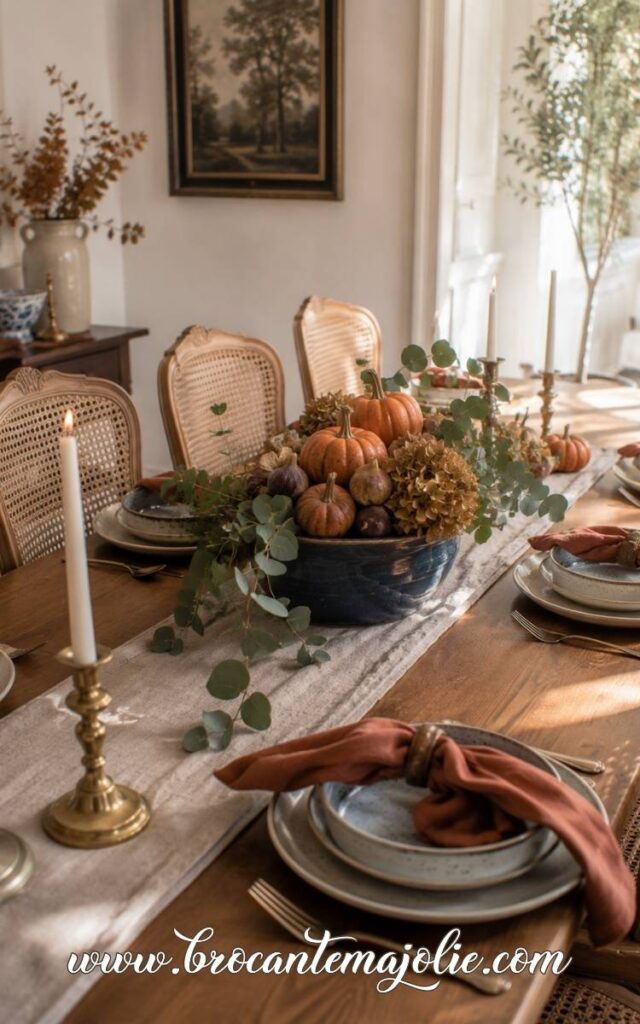
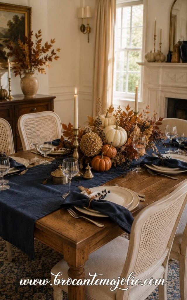
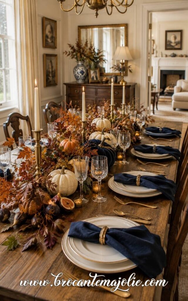
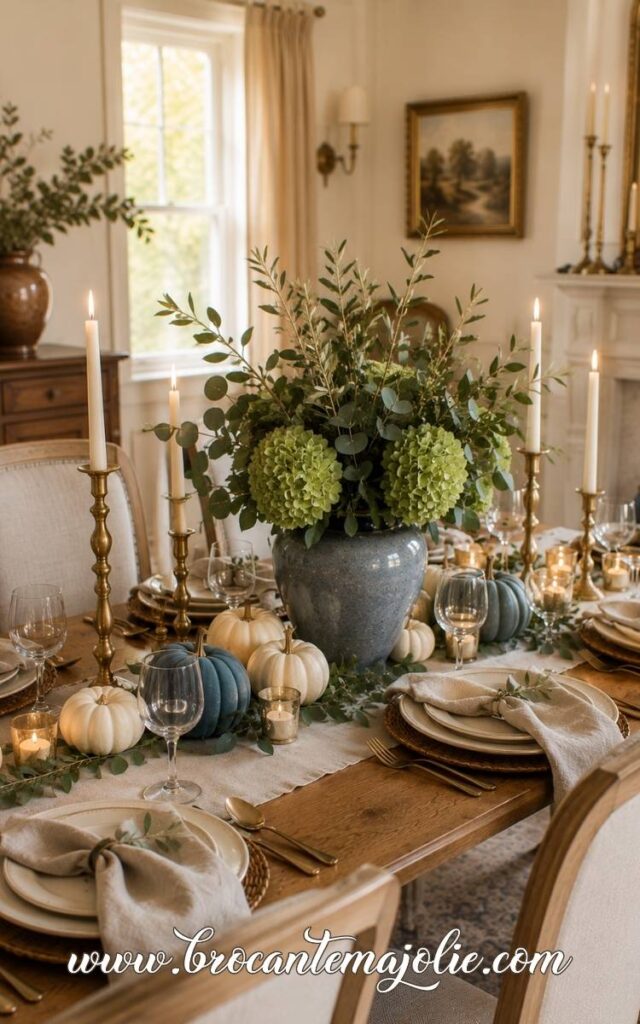
This approach also works for a Thanksgiving table.
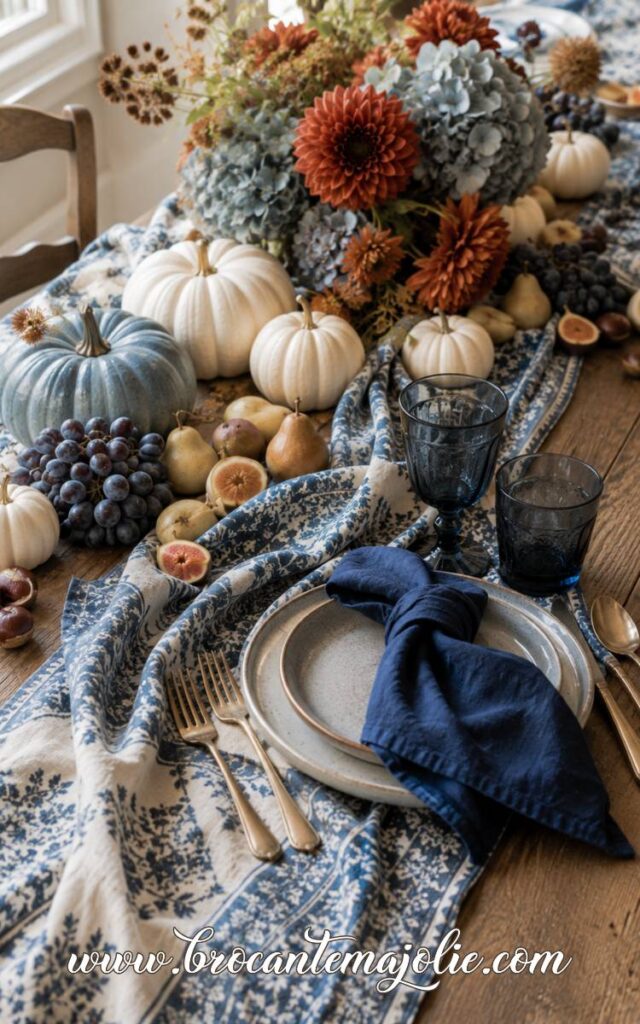
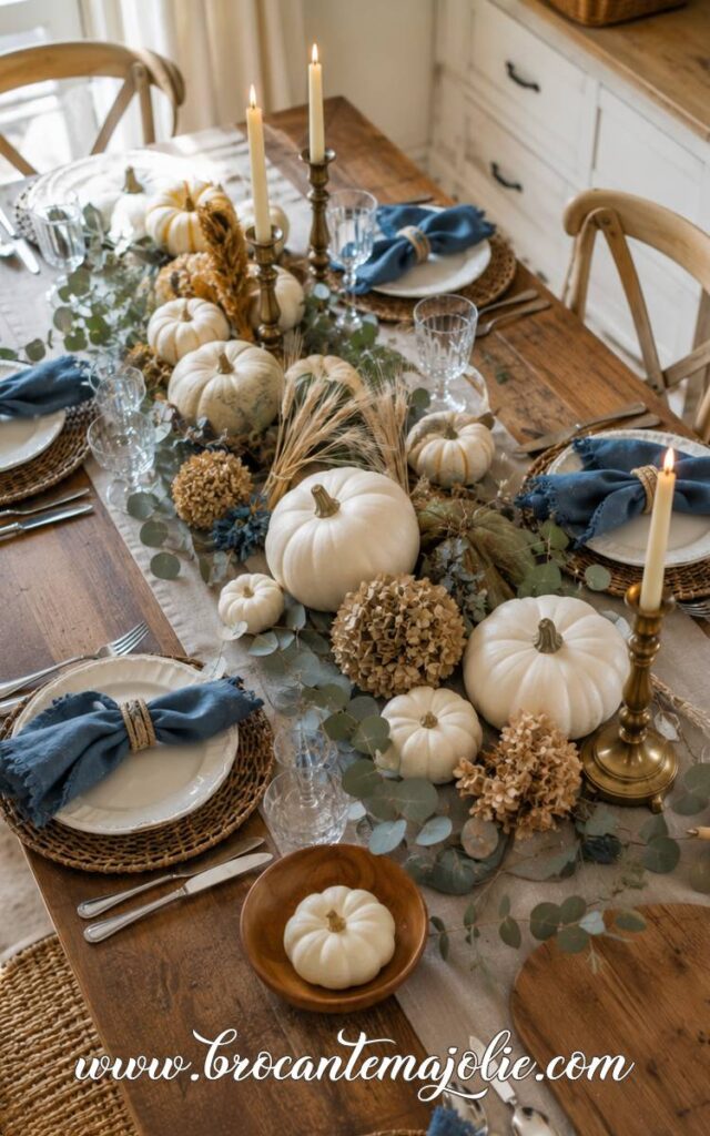
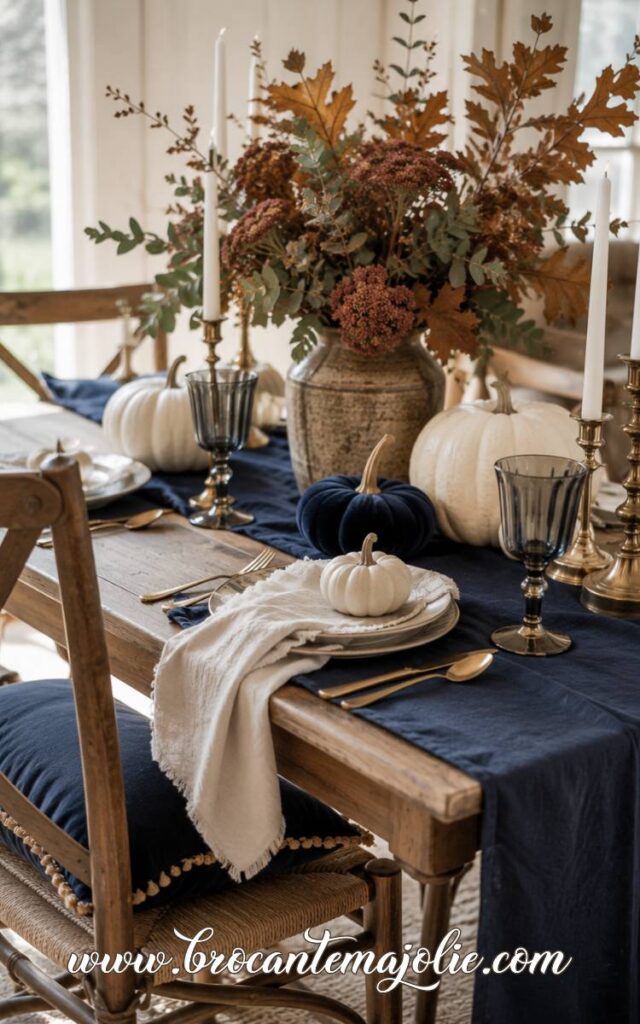
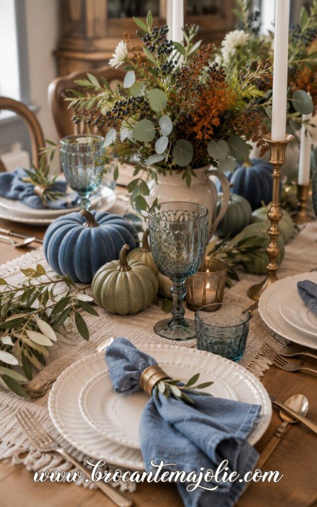
Repeat the blue through napkins, a runner, glassware, or a few pumpkins, then keep the remaining pieces in wood, cream, brass, or warm foliage.
II. Blue and White Fall Decor
Blue and white fall decor can feel very fresh at first, so I like to give it a little warmth before calling it autumn.
Use Blue and White Ceramics With White Pumpkins
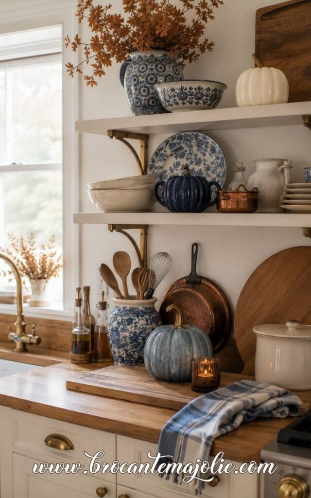
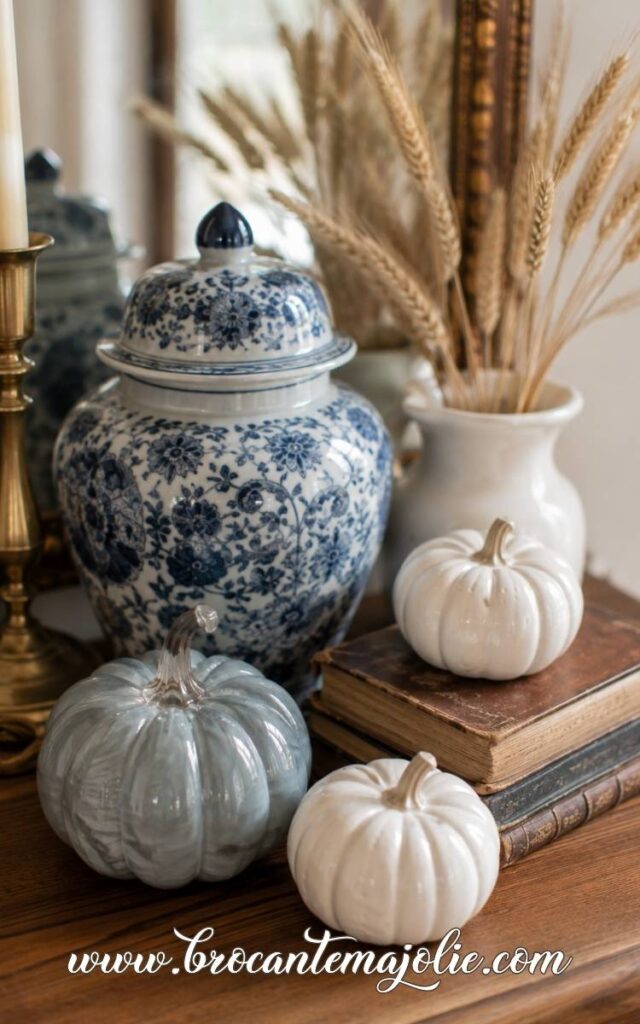
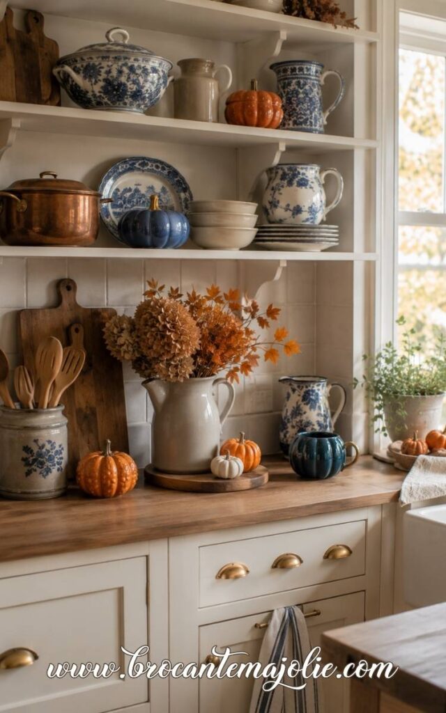
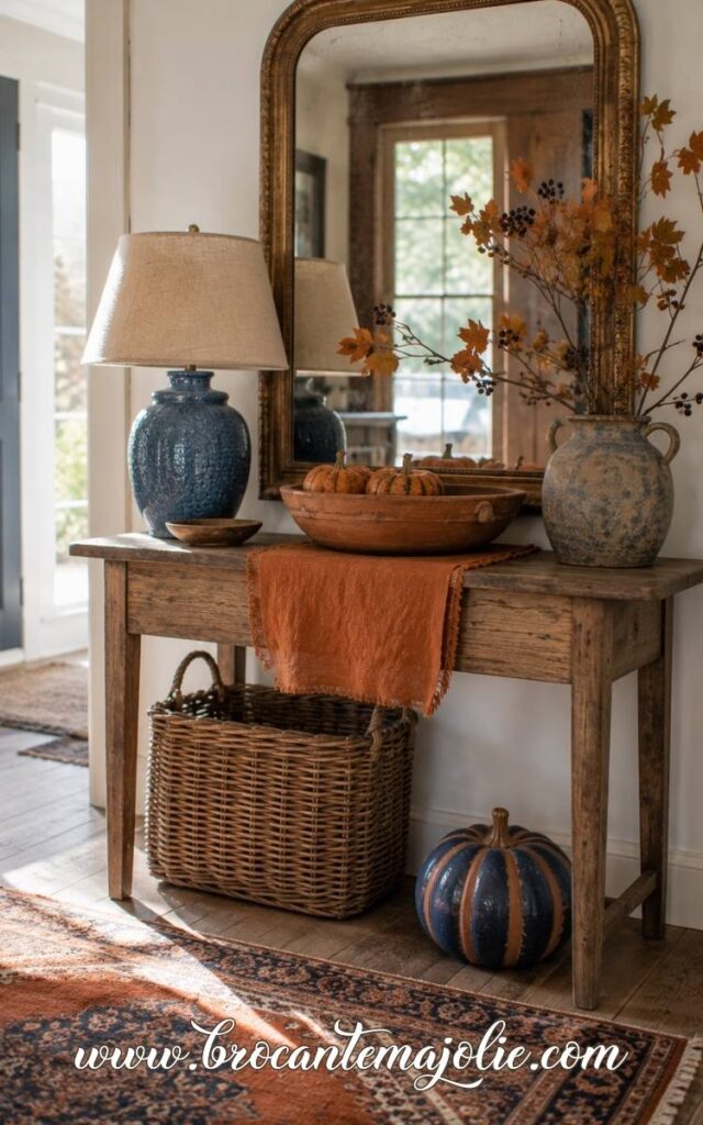
Blue ceramics are a useful starting point because many people already have a bowl, lamp, pitcher, or serving dish they love.
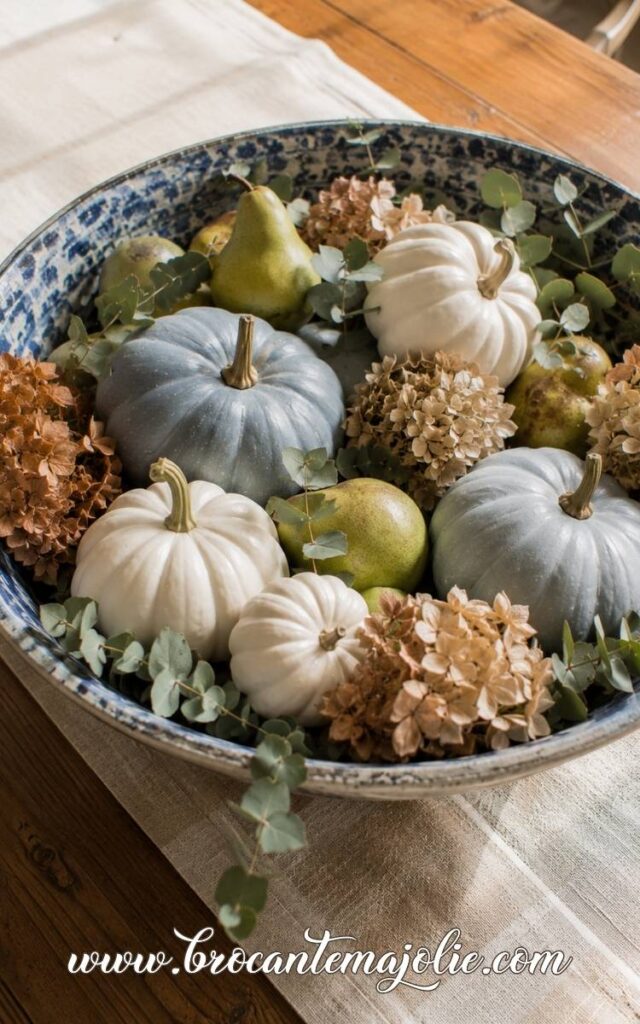
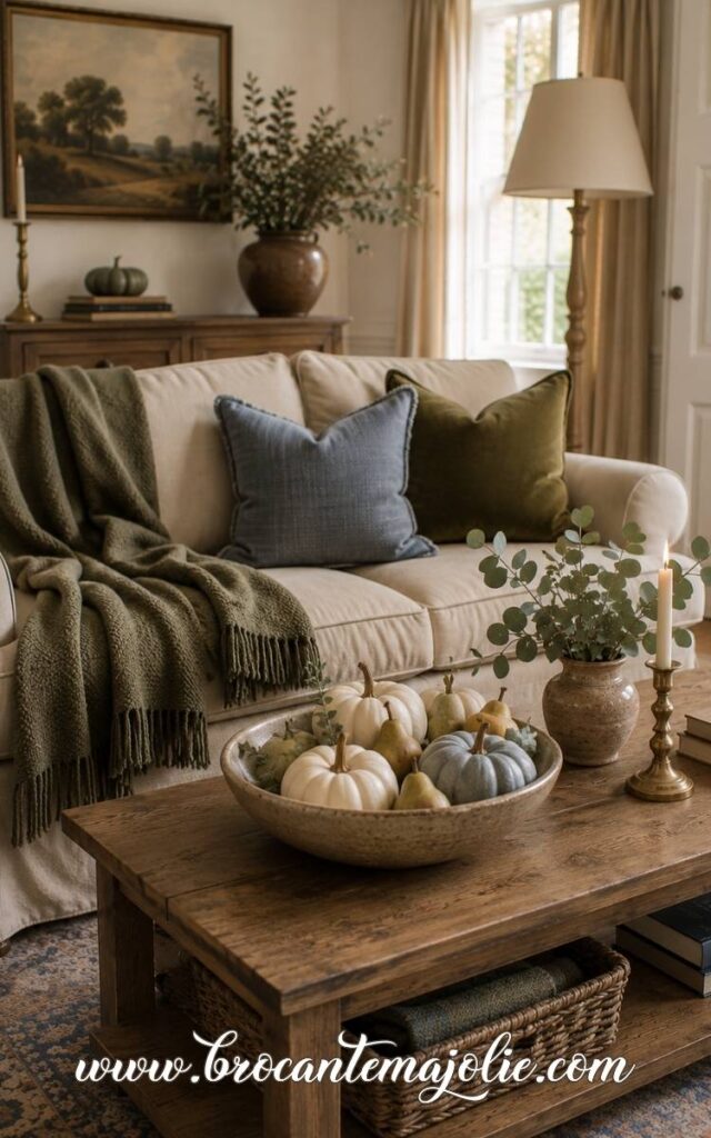
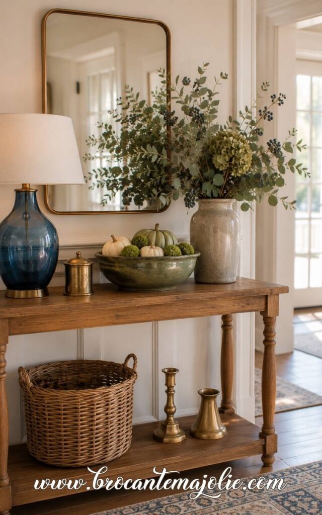
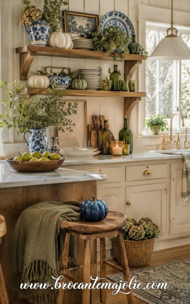
For fall, I would fill a blue bowl with white pumpkins, green pears, walnuts, or small gourds.
A simple pottery pitcher can hold dried hydrangeas, oak branches, or wheat instead of fresh summer flowers.
White pumpkins are especially pretty here because they soften stronger shades of blue. Cream, ivory, and pale beige often work better than a very bright white.
Warm Up the Palette With Wood and Woven Textures
Blue and white needs texture in autumn.
A woven basket, rattan tray, oak table or linen runner changes the mood quickly.
These materials bring in the earthy side of the season without forcing orange into the palette.
I would also add one or two warmer details, such as brass candlesticks, amber glass and dried leaves.
This is especially helpful in a living room.
Blue pillows and white pumpkins can feel a little cool on their own, but they look very different beside a wool throw, an old wood coffee table, and candlelight.
Not sure what fall decor will feel current this season?
I gathered the prettiest trends to help you choose what to try first.
Create a Blue and White Thanksgiving Table
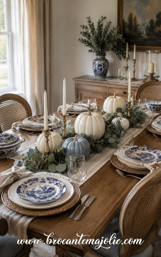
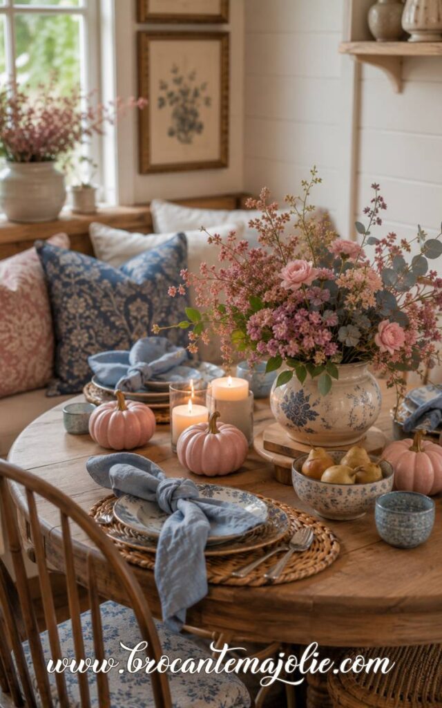
A blue and white Thanksgiving table can feel seasonal without relying on the usual rust and orange everywhere.
I would start with a warm wood table or a neutral linen runner.
Then add white plates, blue napkins, woven placemats, and clear glassware.
Down the center, use white pumpkins in different sizes with eucalyptus, wheat, dried hydrangeas, or low branches.
Brass candlesticks or warm wood serving pieces help the table feel richer.
I would repeat the blue in two or three places: perhaps the napkins, one pumpkin, and a small detail in the centerpiece.
That is usually enough to make the whole color palette feel connected without looking overly matched.
III. Blue and Orange Fall Decor
Blue and orange fall decor has much more energy than blue and white.
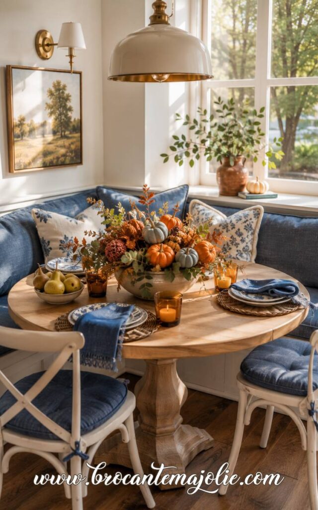
The blue gives the room structure, while the orange brings in the warmth that makes it feel unmistakably like autumn.
I especially like this combination when the orange leans toward rust, terracotta or copper rather than anything too bright.
Let Orange Warm Up the Blue
Orange is what keeps blue from feeling cool or summery.
I would use orange where you naturally expect to see autumn color:
- pumpkins
- dried leaves
- mums or dahlias
- candles
- throws and pillows
- woven or block-printed textiles
Use Blue as the Base and Orange as the Accent
This color scheme usually works best when one shade leads and the other supports it.
If the room already has blue through a couch, rug, curtains, or artwork, let blue remain the base.
Bring orange in through the smaller fall decorations: pumpkins, branches, pillows, candles, and flowers.
That balance keeps the room calm enough to live with.
The reverse can work too.
In a room with warm wood, orange textiles, and autumn branches, one blue bowl, lamp, or pumpkin can cool the palette slightly and make it feel more distinctive.
I tend to prefer blue as the larger visual element and orange in smaller doses.
Natural materials help bring the two colors together.
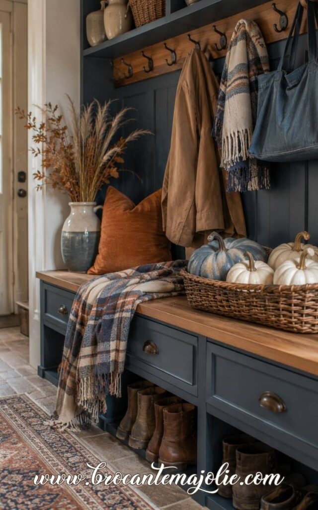
Oak, walnut, aged brass, linen, clay, and woven baskets sit comfortably between cool blue and warm orange.
Style a Blue and Orange Wreath or Centerpiece
A wreath is a good place to combine these colors because you can mix several shades without changing the whole room.
The same idea works for a centerpiece.
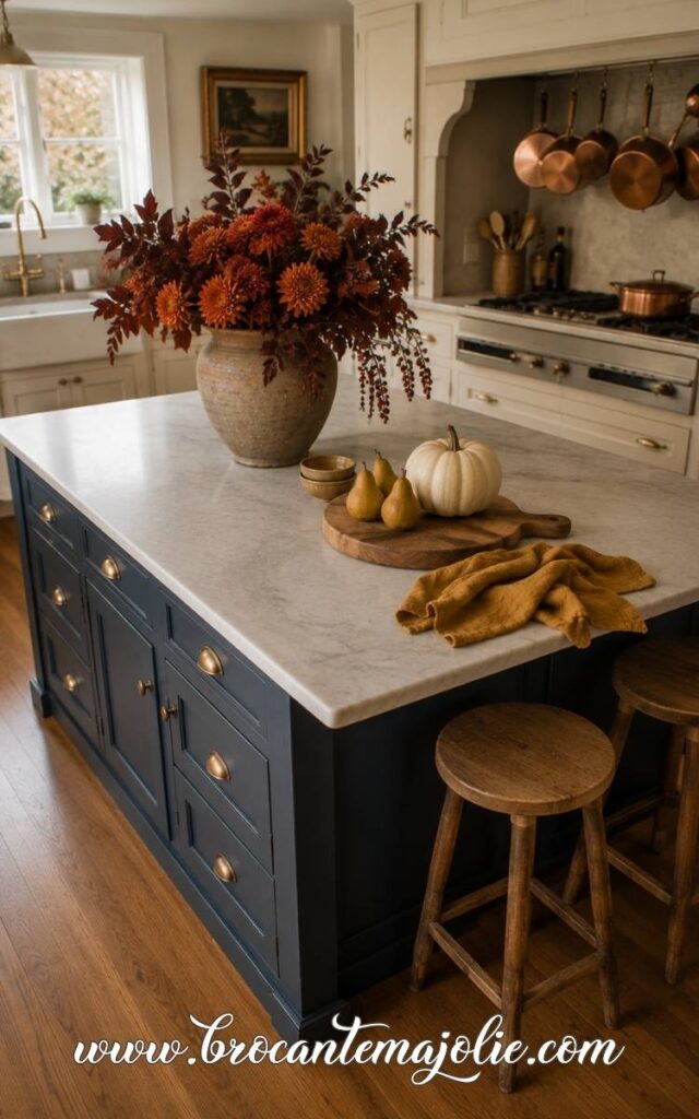
For a more floral arrangement, try burnt orange dahlias, faded blue hydrangeas, burgundy foliage, and eucalyptus in a neutral or blue-gray container.
Blue and orange work because they balance each other so well.
The orange brings in the season, while the blue keeps the palette from feeling like every other fall room.
IV. Navy Blue Fall Decor
Navy blue fall decor feels deeper and more structured than pale blue.
A few navy accents can give an autumn room more depth very quickly.
I especially like navy in textiles, ribbon, pumpkins, table linens, and small accessories.
It gives the whole color palette a richer base without making the room feel dark.
Use Navy as the Anchor Color
Navy works well when it appears in two or three clear places.
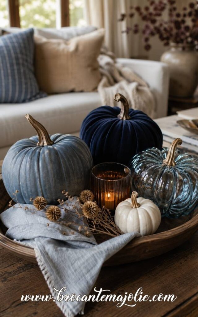
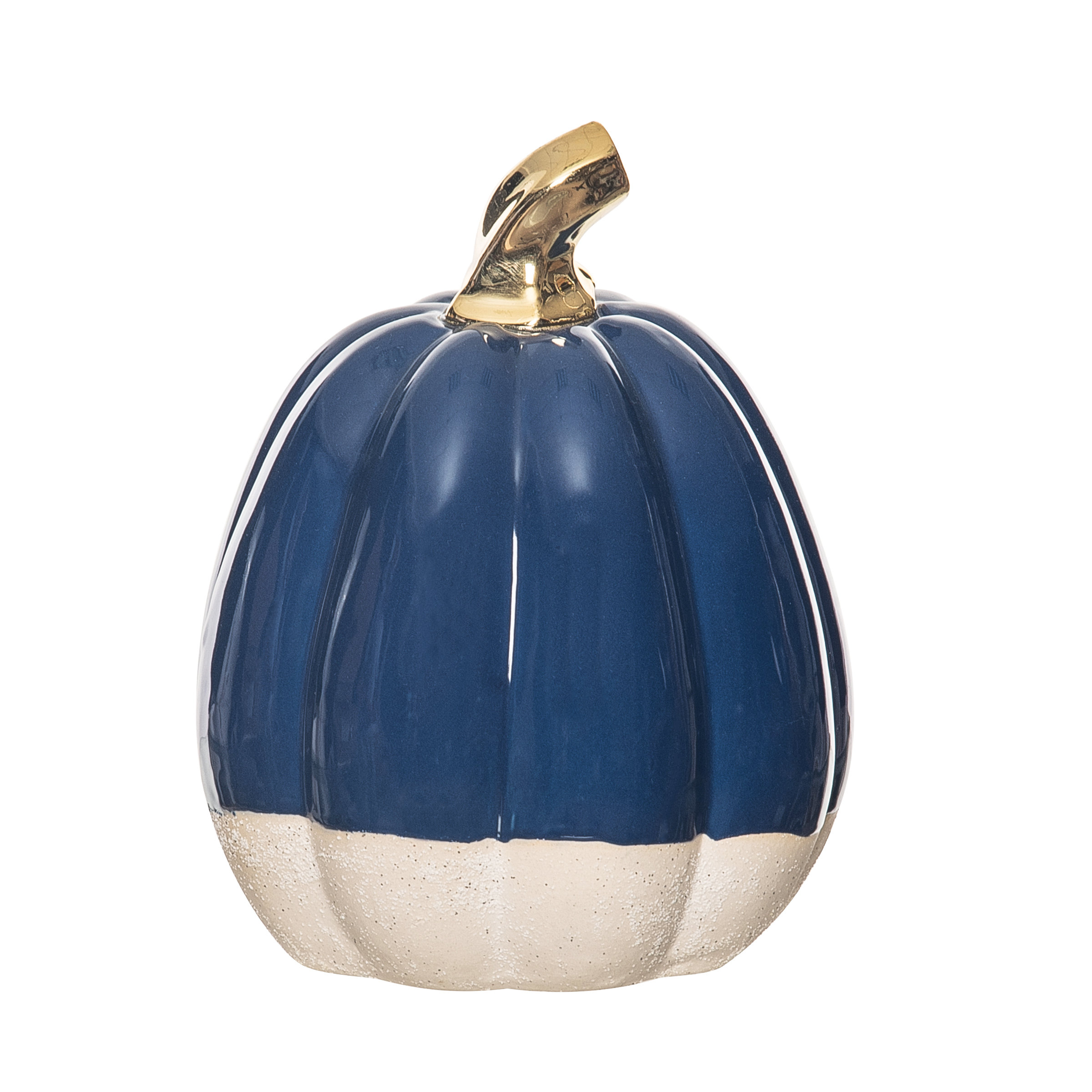
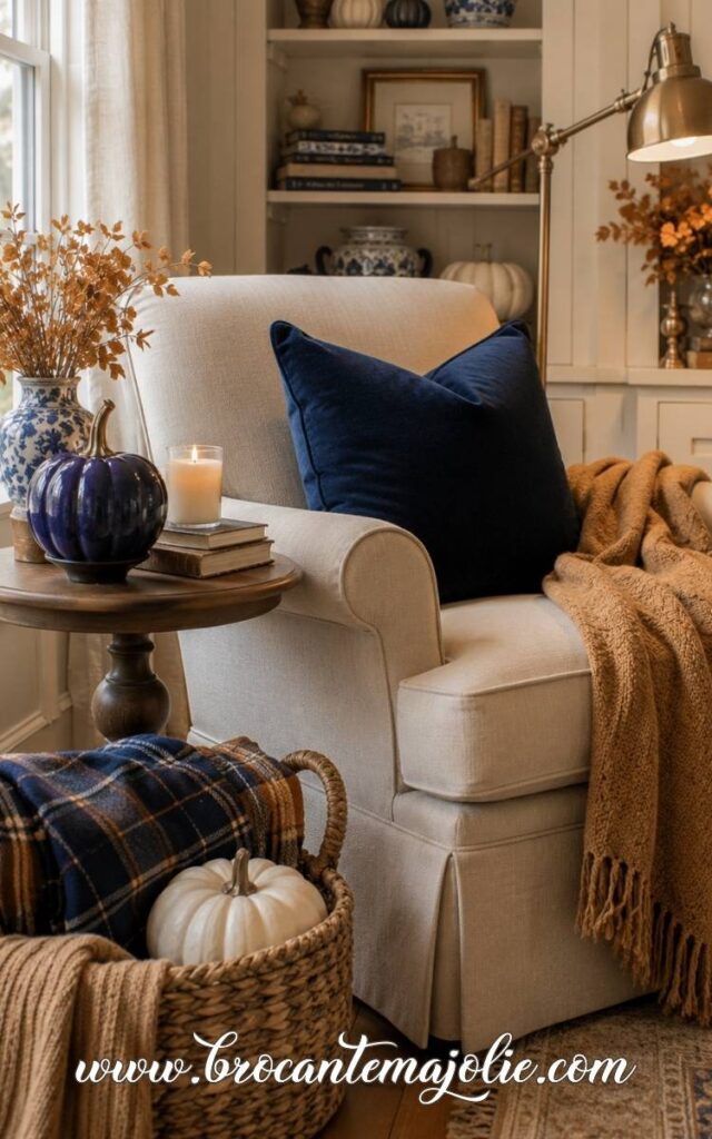
You might use a navy pillow on the couch, a folded navy throw nearby, and one small navy ceramic pumpkin on the coffee table.
That is usually enough to establish the color without repeating it across every surface.
If the sofa is neutral, navy can give the seating area more definition.
If the couch is already blue, I would let it remain the main navy element and add autumn color around it instead.
Cream pumpkins, burnt orange flowers, brown leather, amber glass, and warm wood will make the blue feel much more seasonal.
Pair Navy With Brass, Wood, and Warm Neutrals
Navy can look quite formal on its own, so I like to soften it with materials that feel warmer and more natural.
Brass is especially useful here.
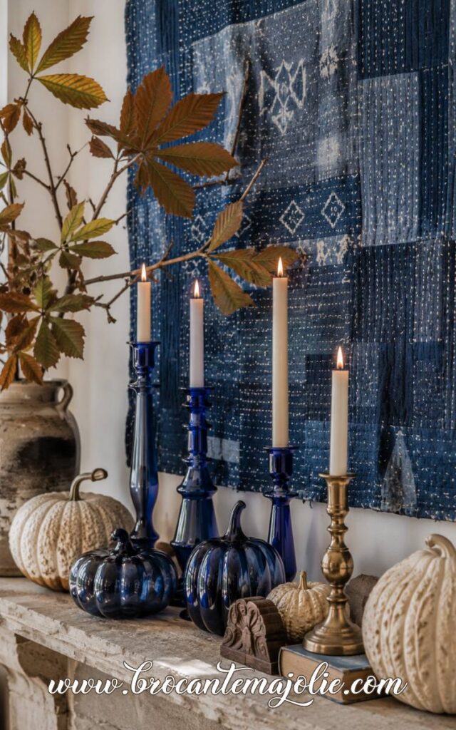
A pair of aged brass candlesticks, a small tray, or a warm metal lamp can brighten navy.
Wood does the same thing. Walnut, oak, and darker stained pieces bring out the warmth in the blue.
For textiles, I would choose warm neutrals.
Set a Navy Thanksgiving Table
Navy works especially well for Thanksgiving because it gives the table a more grounded feeling while still leaving plenty of room for traditional autumn colors.
A simple combination might be:
- navy linen napkins
- cream dinnerware
- brass candlesticks
- white and muted orange pumpkins
- clear glassware
- a low centerpiece with dried foliage
Decorating the whole porch too?
You may also enjoy these Fall Front Porch Decor Ideas That Wow!
V. Blue and Green Fall Decor
Blue and green fall decor feels especially natural.
The key is choosing greens that feel a little quieter than spring green.
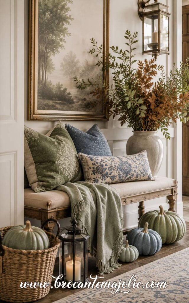
Sage, olive, moss, eucalyptus, and deep leaf green all sit beautifully beside faded blue, denim, blue-gray, and navy.
I also like this palette because it does not need much orange to feel like autumn.
Texture does most of the work.
Combine Blue With Sage, Olive, and Eucalyptus
Different blues need different greens.
Muted shades are easier to layer.
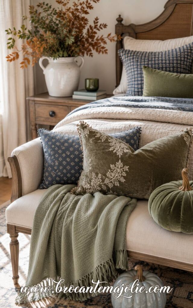
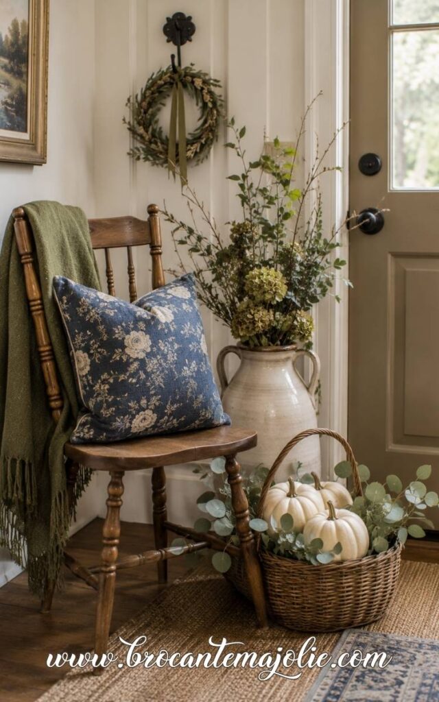
On a neutral couch, try one faded blue pillow, one olive velvet pillow, and a cream or camel throw.
A blue plaid textile can also bring several tones together without making the sofa look too coordinated.
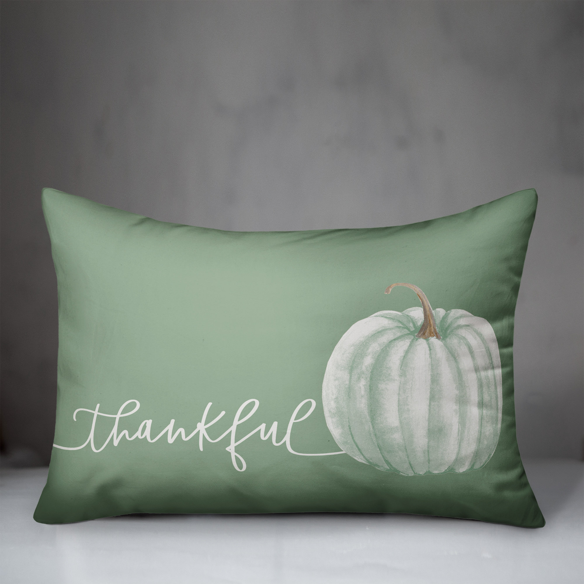
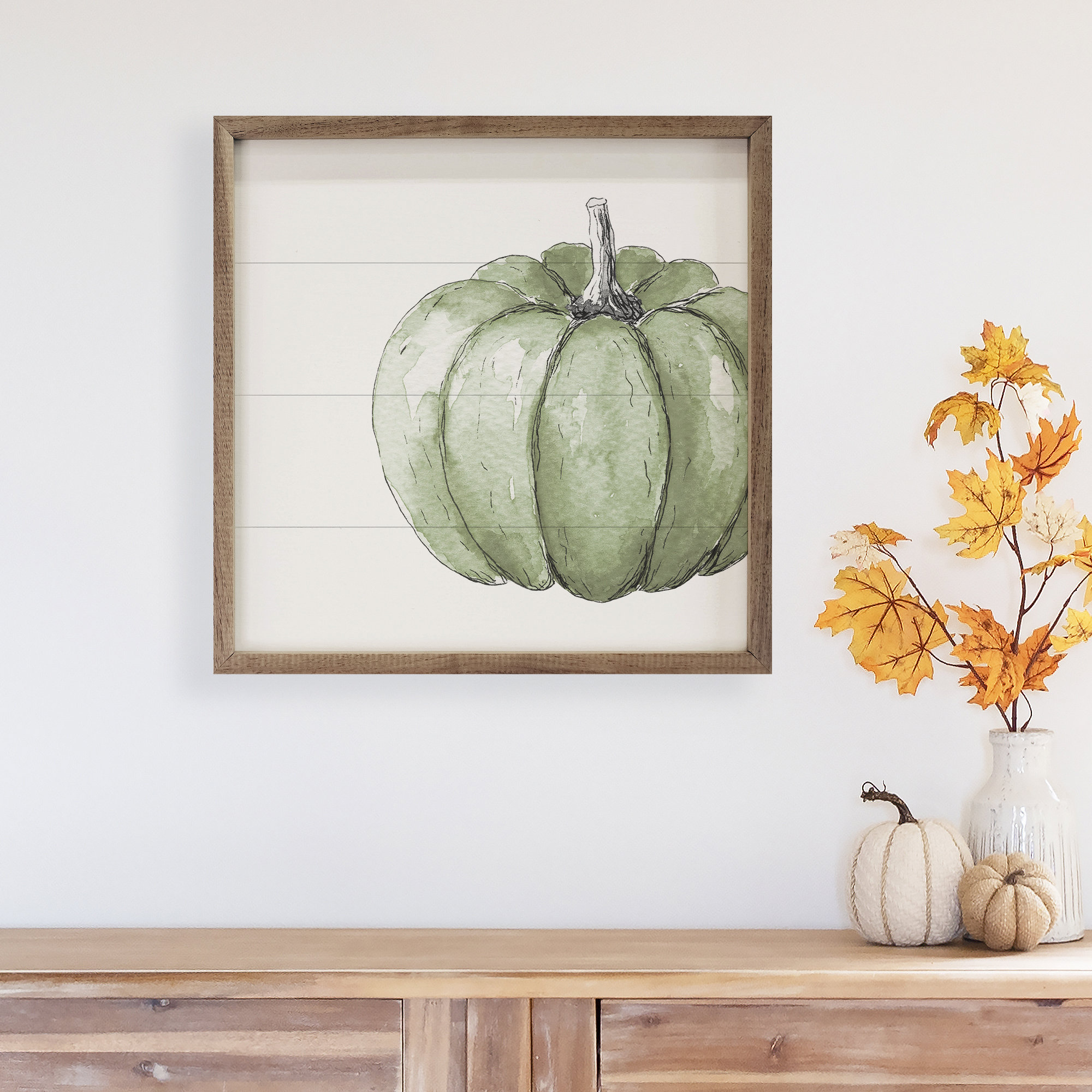
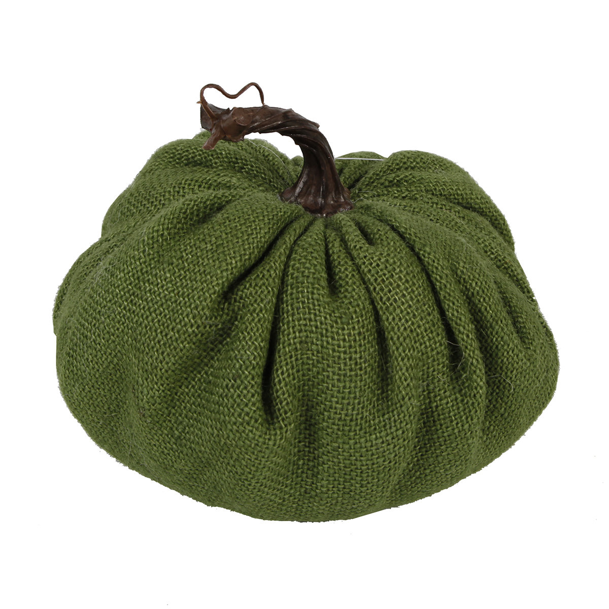
For seasonal decorations, mix a dusty blue pumpkin with pale green heirloom pumpkins, white ceramic pieces, and a few natural gourds.
The colors feel related, but the different shapes and finishes keep the display interesting.
Use Greenery to Make Blue Feel More Autumnal
Greenery is what gives this color scheme its more natural side.
Eucalyptus, olive branches, magnolia leaves, ivy, and moss all work well with blue.
In fall, I would mix them with dried materials rather than using only fresh green stems.
Add wheat, seed heads, dried hydrangeas, bare branches, or a few leaves turning brown at the edges.
Those details move the greenery away from spring and toward autumn.
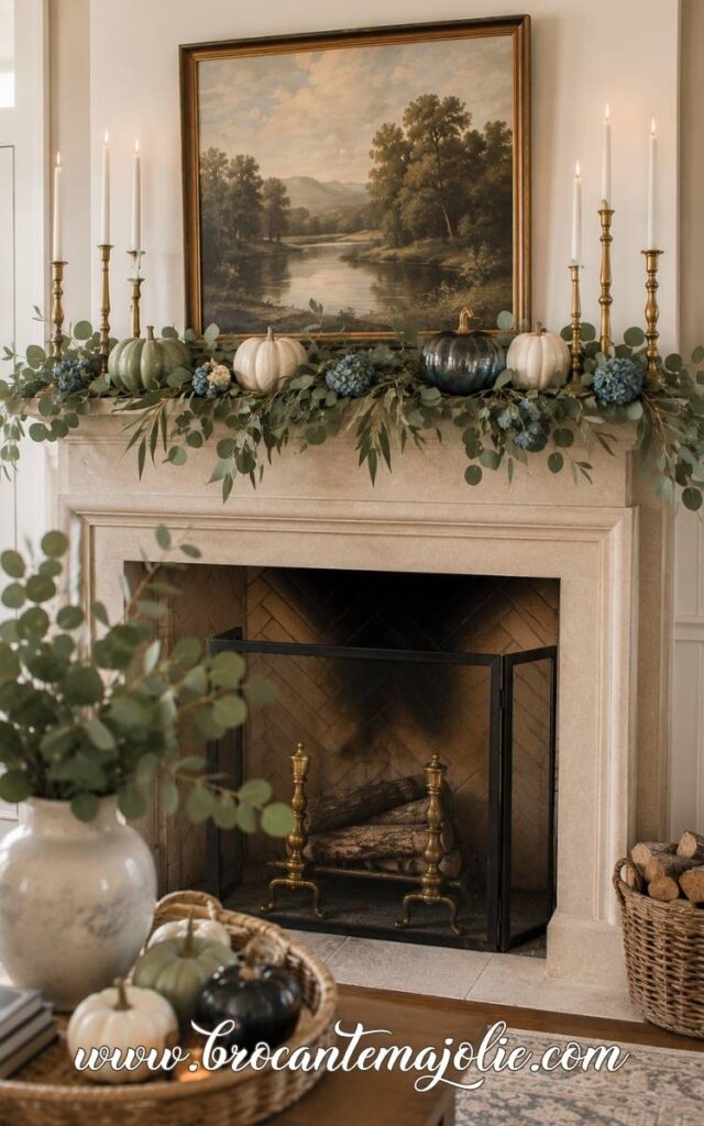
A fall wreath is a good place to use this mix. The same idea works on a mantel.
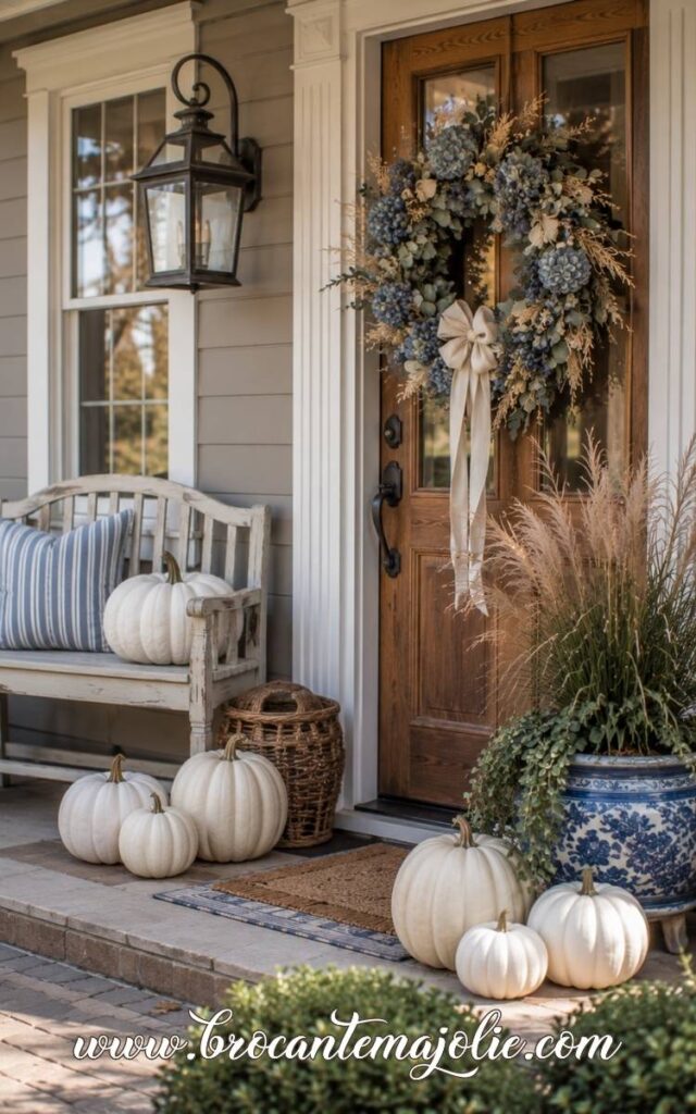
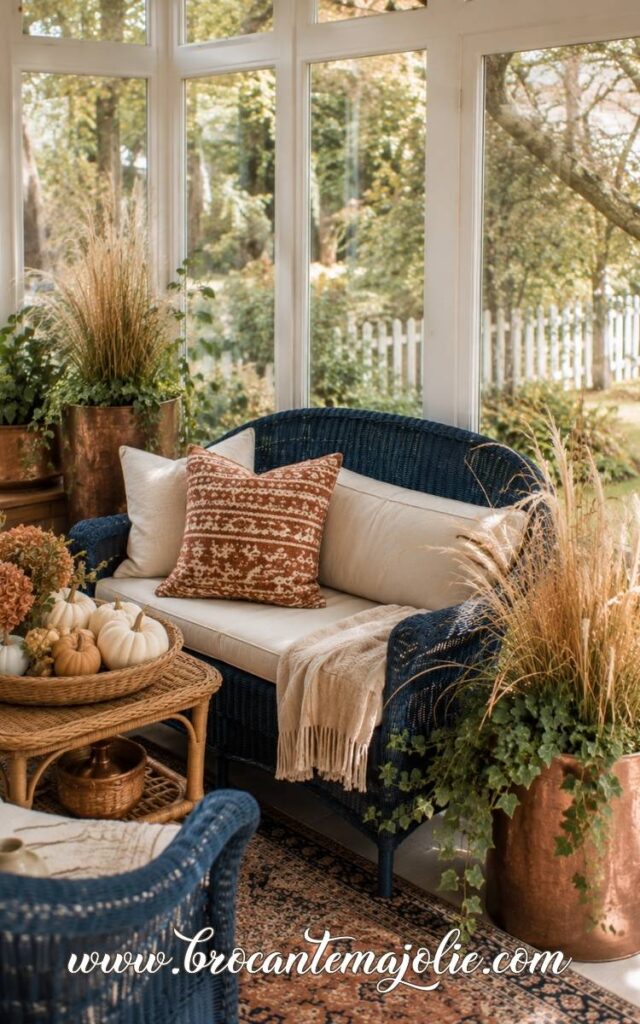
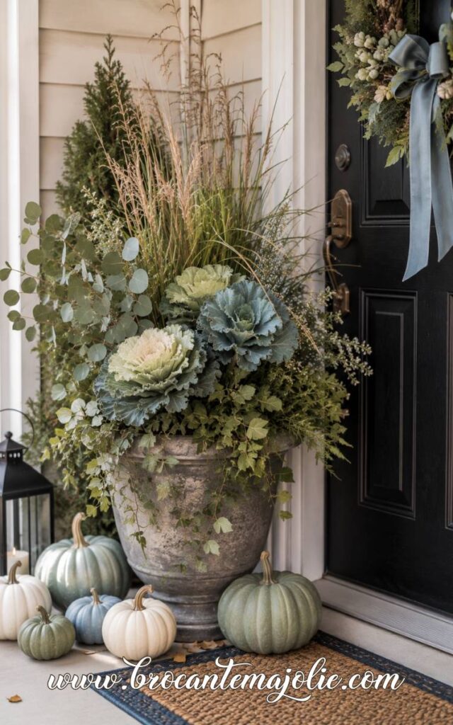
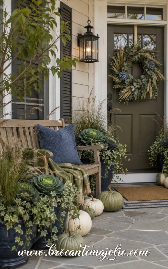
For a front porch, use green through planters rather than only accessories.
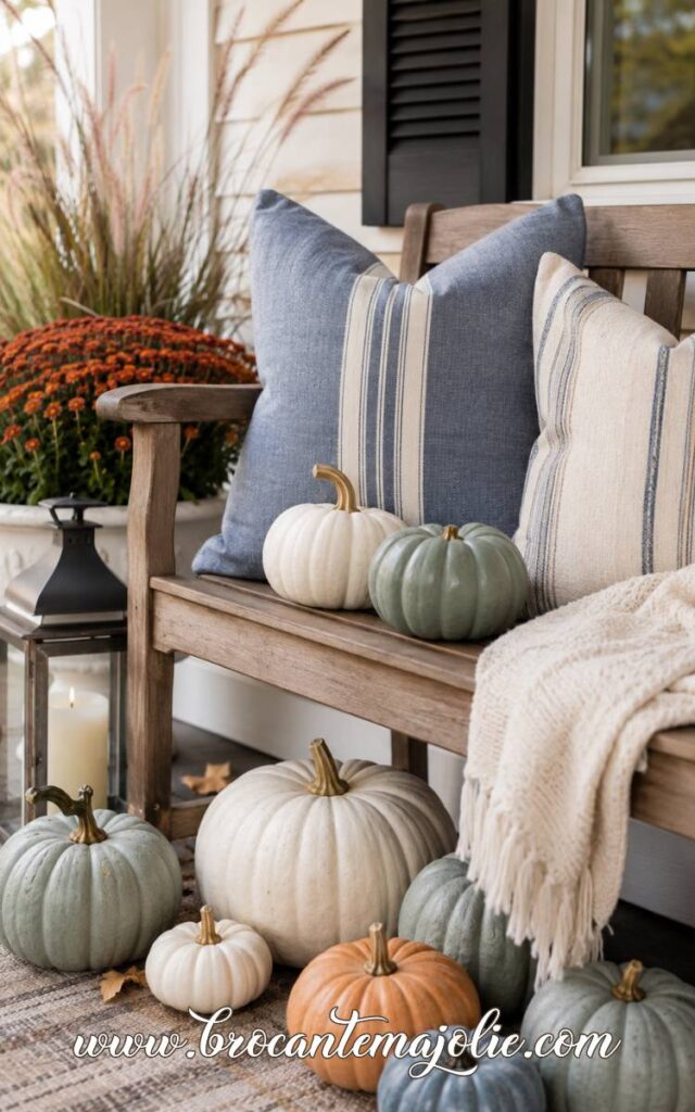
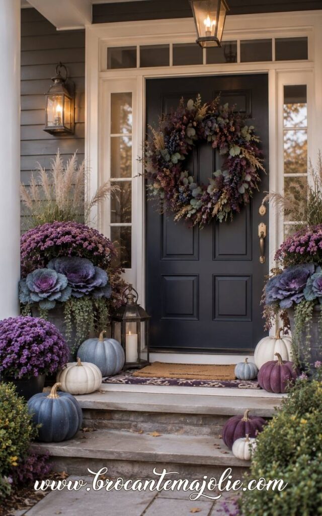
Ornamental cabbage, ivy, grasses, and eucalyptus-like foliage look beautiful beside blue-gray pumpkins and white pumpkins.
Build a Blue and Green Centerpiece
Blue and green centerpieces can feel very full and seasonal without using many flowers.
A blue ceramic bowl or blue-gray vase makes a good starting point.
Fill it with green pears, pale pumpkins, eucalyptus, dried hydrangeas, and a few branches.
For a dining table, I would spread the color across the center rather than placing everything in one tall vase.
A warm wood table is ideal because it keeps the blue and green from feeling cool.
For a kitchen island, the centerpiece can be slightly taller.
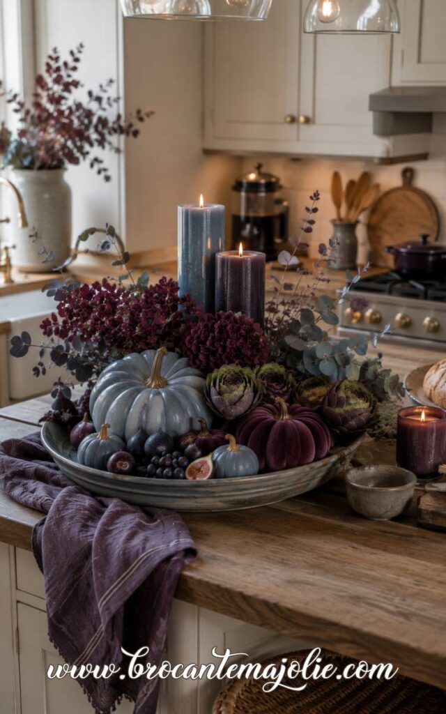
A blue stoneware vase with olive branches and dried hydrangeas, surrounded by green pumpkins and one candle, gives the island enough autumn presence without taking over the whole surface.
Looking for easy fall living room inspiration?
I gathered ideas you can copy whether your style is neutral, colorful, rustic, or more classic.
VI. Pink and Blue Fall Decor
Pink and blue fall decor can feel surprisingly autumnal when the shades are muted.
I would avoid bright bubblegum pink or clear summer blue here.
Dusty rose, mauve, faded blue, blue-gray, and navy have much more depth.
Choose Muted Pink and Soft Blue
The shade choice matters more than the number of decorations.
Blush and pale blue can feel very light, while dusty rose and blue-gray create a more settled autumn palette.
Cream is useful between the two colors.
It gives the eye a place to rest and keeps pink and blue from looking too decorative.
Warm metals help too.
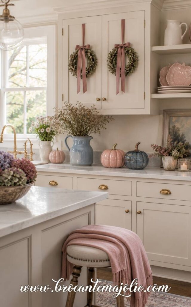
A brass candlestick, aged gold frame, or amber glass candle can make the palette feel richer and more seasonal.
Add Pink and Blue Pumpkins
Pumpkins make this color combination clearly fall.
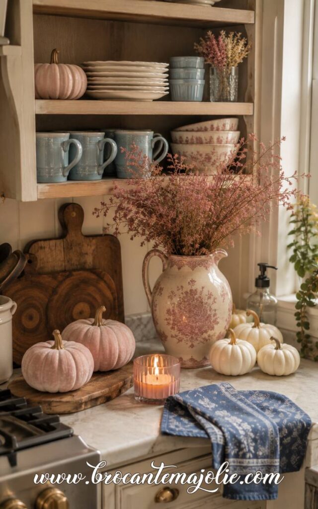
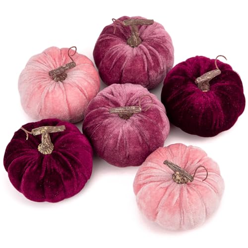
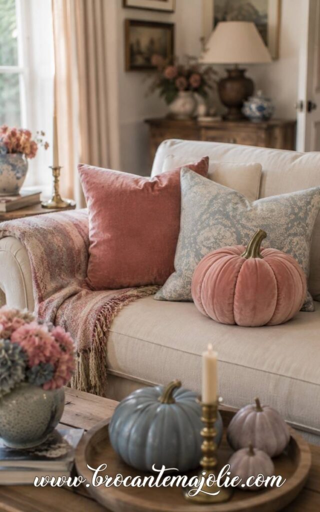
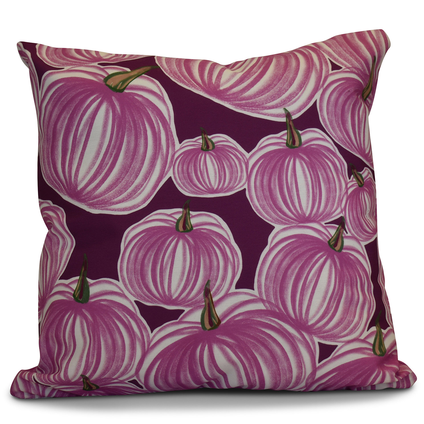
Velvet pumpkins are especially pretty in dusty rose, mauve, and faded blue because the fabric deepens the colors.
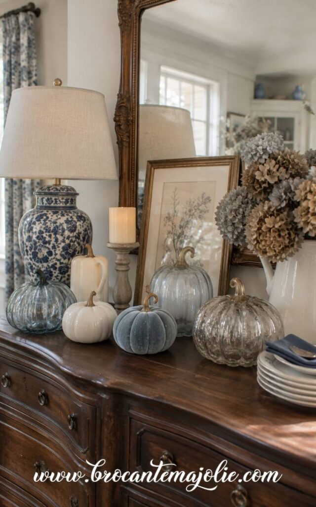
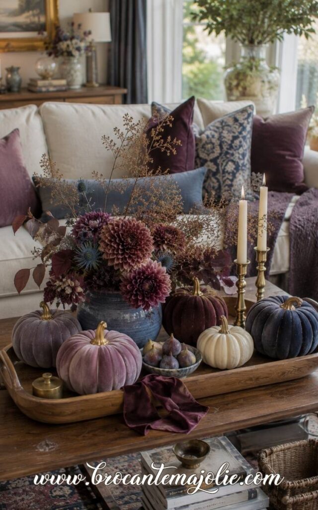
On a coffee table, I would group a blush velvet pumpkin with a blue-gray ceramic pumpkin and one cream pumpkin.
Add a candle, a small vase of dried flowers, or a few old books so the pumpkins feel part of a real arrangement.
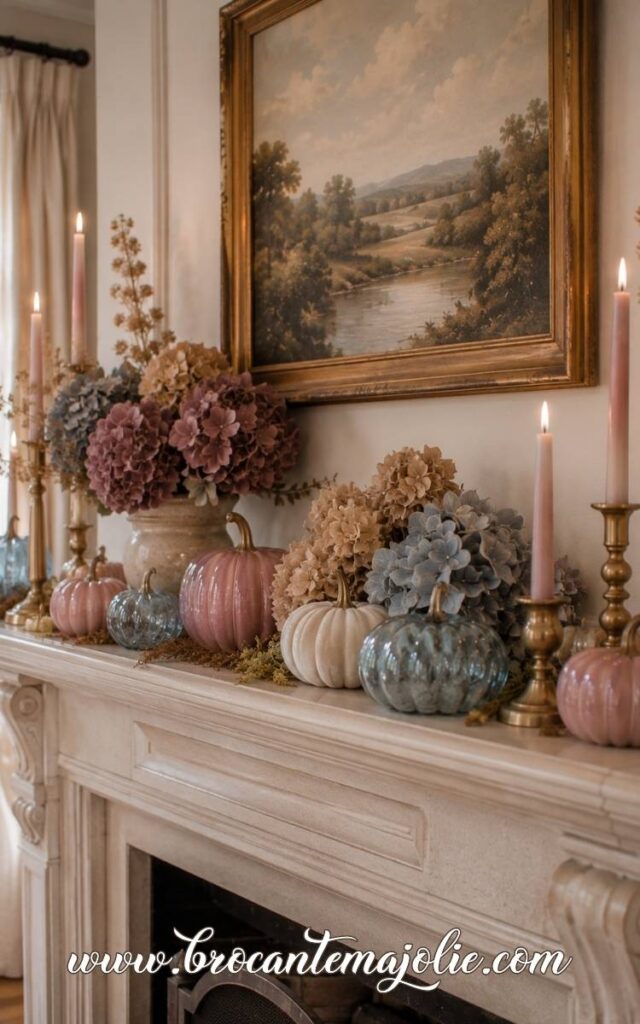
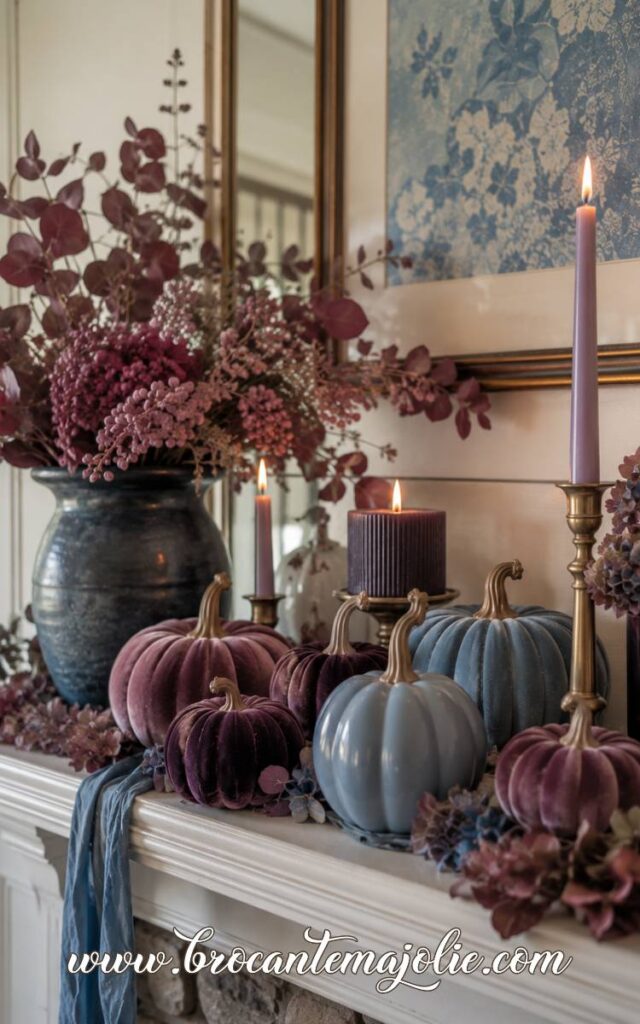
On a mantel, mix pink and blue pumpkins with cream candles, brass details, and dried hydrangeas.
The display can be quite full, but repeating the same few shades keeps it connected.
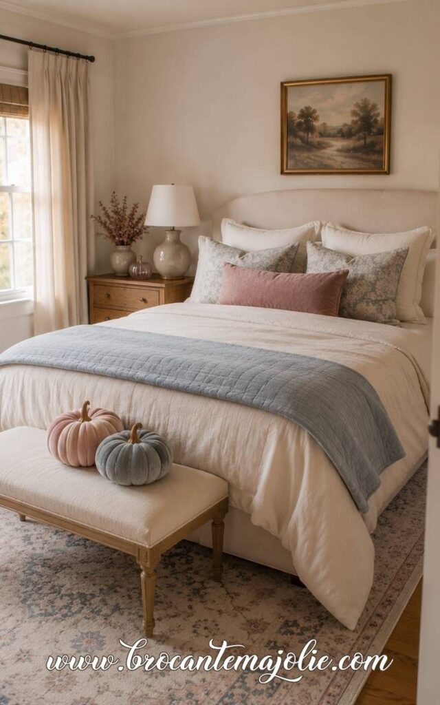
This also works well in a bedroom.
A small velvet pumpkin on a bench, a dusty rose pillow, and a faded blue throw can bring in autumn without making the room feel heavily decorated.
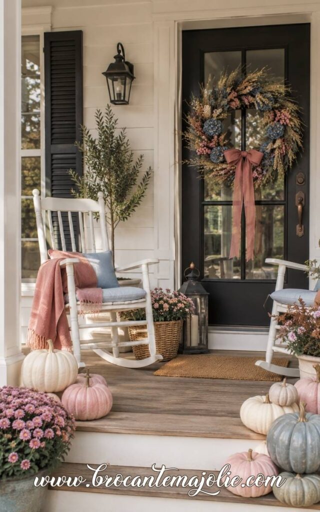
For a porch, use the deeper versions of the palette.
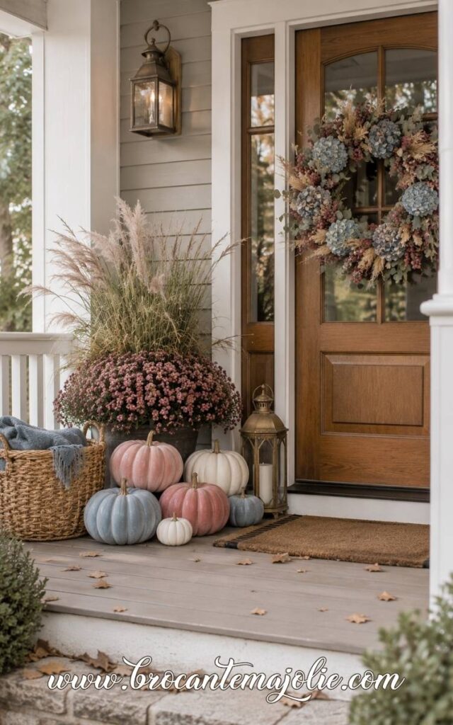
Mauve mums, blue-gray pumpkins, cream gourds, and a wreath with faded hydrangeas feel more substantial outside than very pale blush tones.
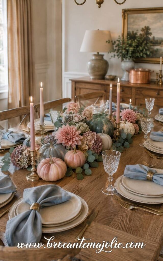
Style a Feminine Fall Centerpiece
A pink and blue centerpiece can feel romantic, but it should still have enough texture to read as autumn.
Start with pumpkins in blush, mauve, faded blue, and cream.
Then add flowers or foliage with more depth: dried hydrangeas, dahlias, berry stems, eucalyptus, seed heads, or plum branches.
Brass candlesticks and warm linen help ground the softer colors.
VII. Blue and Purple Fall Decor
Blue and purple fall decor has more depth than the softer palettes in this article.
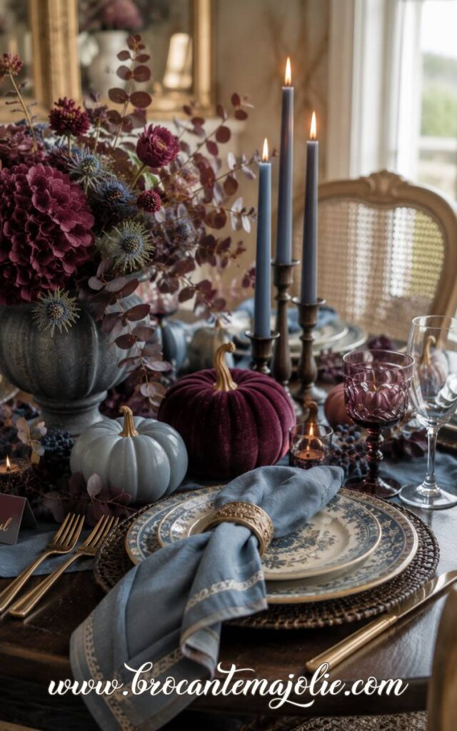
These colors work especially well when the blue is smoky, denim, or navy, and the purple leans toward plum, mauve, aubergine, or burgundy.
Together, they can feel rich and very autumnal.
Pair Plum and Burgundy With Deep Blue
Purple becomes much easier to decorate with when you move away from bright violet.
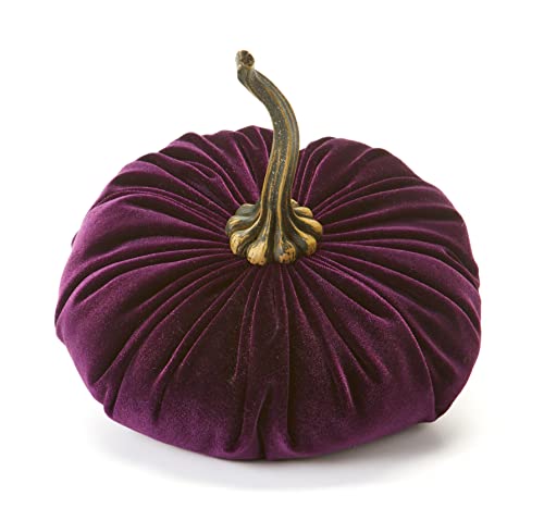
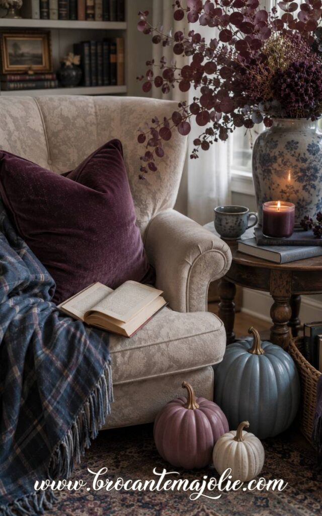
A neutral couch could be styled with one navy pillow, one plum velvet pillow, and a warm cream throw.
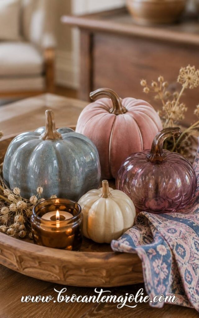
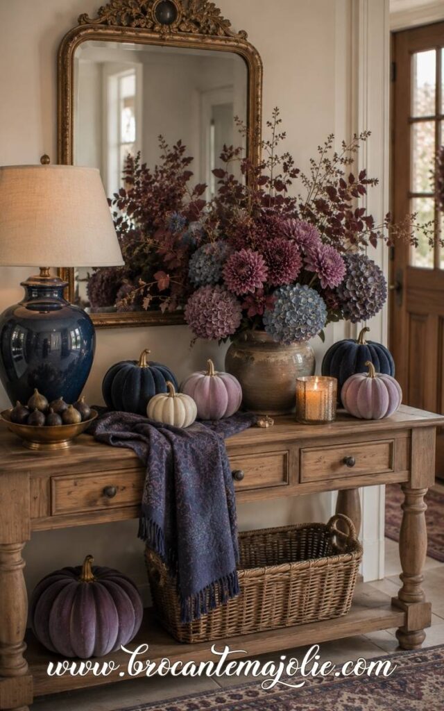
On the coffee table, repeat the palette with a blue-gray pumpkin, a dark purple pumpkin, and a low vase of dried hydrangeas.
Cream or warm beige is useful between the two stronger colors.
It keeps the room from becoming too dark and makes the blue and purple look more intentional.
Use Blue and Purple Pumpkins for a Richer Fall Display
Pumpkins make this palette feel clearly connected to autumn.
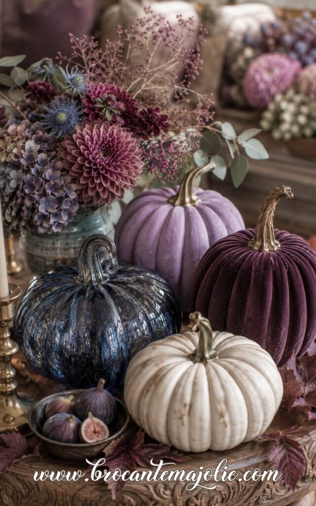
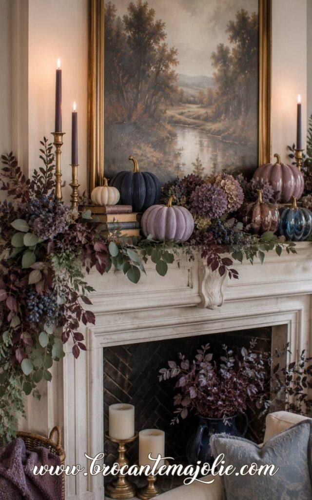
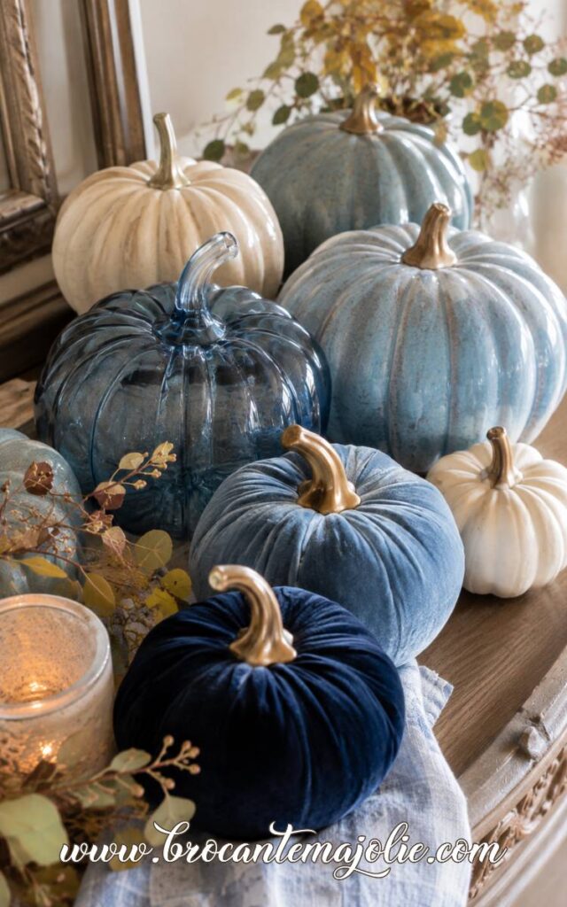
For a mantel or console, mix a matte navy pumpkin with a plum velvet pumpkin, a smoky blue glass pumpkin, and one cream pumpkin.
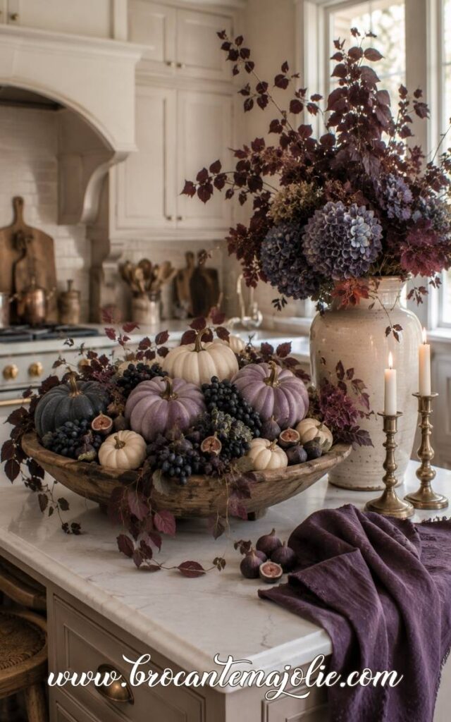
I would add natural details around them rather than more decorative pieces: dried hydrangeas, eucalyptus, berry stems, figs, dark grapes, or a few brown leaves.
A bowl of small blue and purple pumpkins can also work on a kitchen island or dining table.
Use several related tones rather than one exact shade repeated over and over.
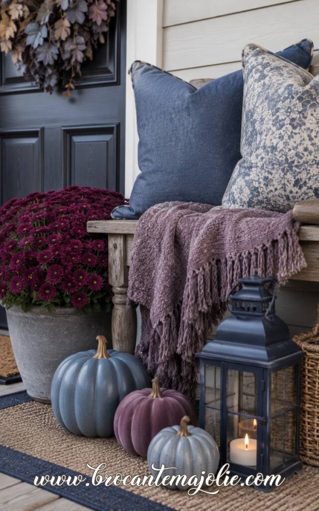
For a porch, the colors need enough contrast to be seen from the street.
Blue-gray pumpkins, cream pumpkins, plum mums, purple cabbage, and dark foliage make a stronger outside display than pale lavender alone.
Create a Blue and Purple Wreath or Centerpiece
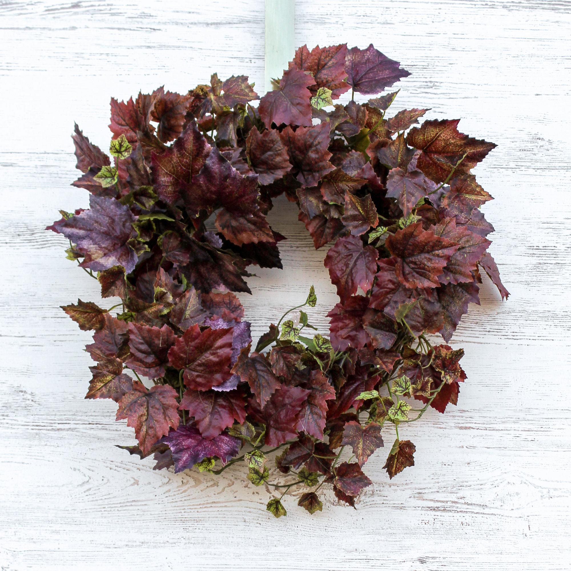
A wreath is one of the easiest places to make this color combination feel natural.
Use faded blue hydrangeas, purple berries, eucalyptus, dried leaves, and cream seed heads.
A navy or plum ribbon can finish it.
For a centerpiece, combine blue and purple pumpkins with low florals, cream candles, and a few darker fruits.
Figs, grapes, and pears fit this palette beautifully and make the arrangement feel fuller without adding another decorative theme.
A Thanksgiving table could include navy napkins, cream plates, brass candlesticks, smoky blue pumpkins, and small plum floral arrangements.
If your kitchen feels too plain for the season, these fall kitchen decor ideas will help you warm it up without cluttering the counters.
Blue changes completely depending on what you place beside it.
With white, it feels fresh and calm.
Orange makes it warmer and more traditional.
Navy gives the room more depth, while green feels natural and pink or purple creates something softer and more unexpected.
That variety is exactly why I like blue fall decor.
You can work with the blue already in your home instead of putting it away when autumn begins!
SAVE THIS POST FOR LATER
Just hover over an image and click the Pinterest icon to pin it!