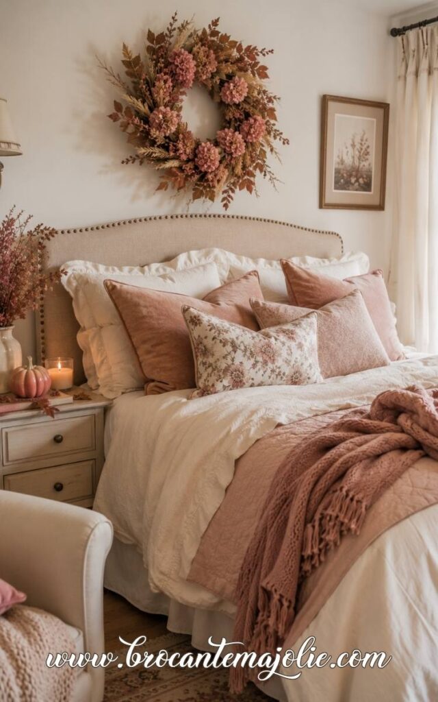
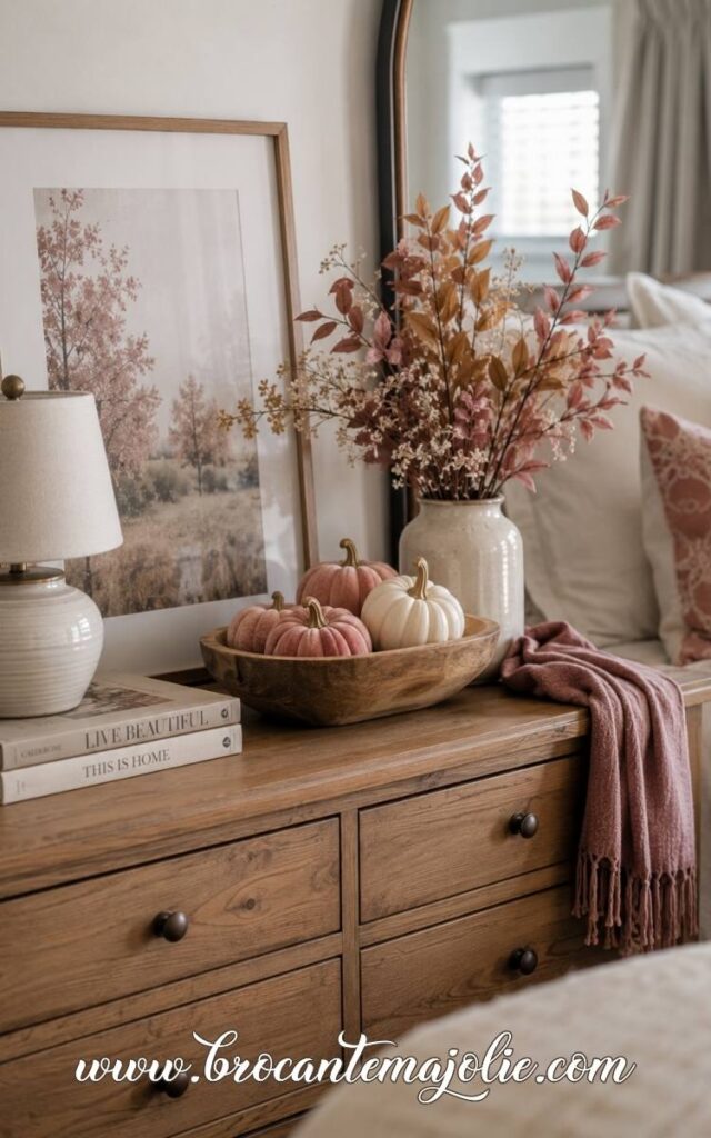
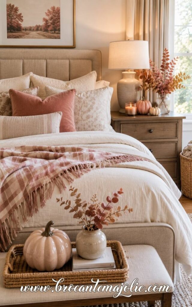
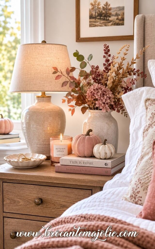
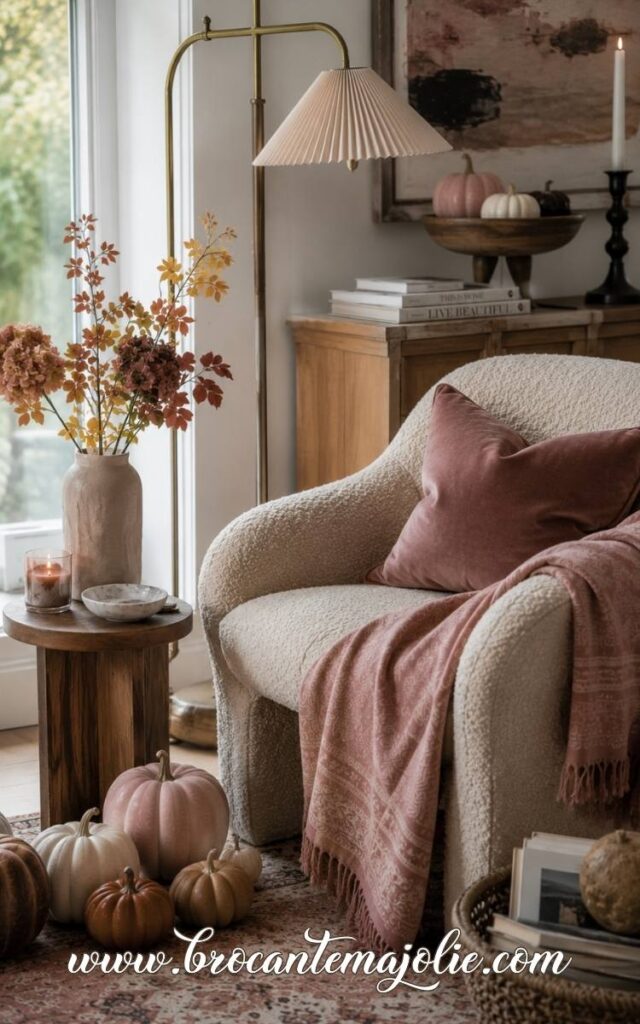
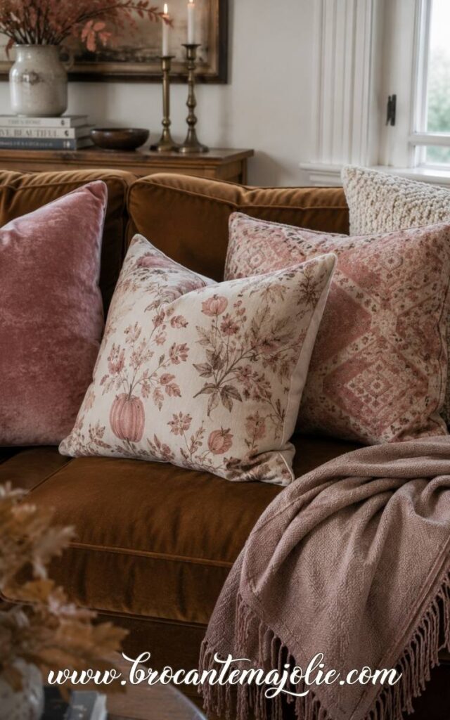
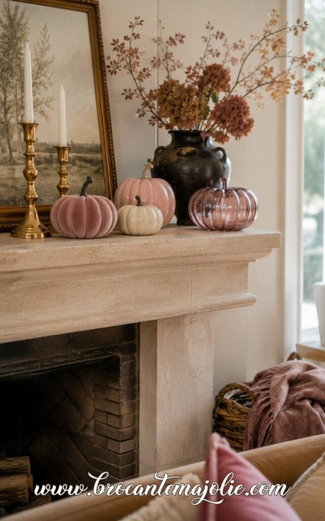
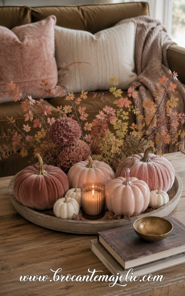
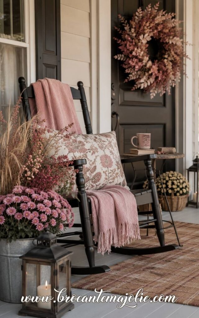
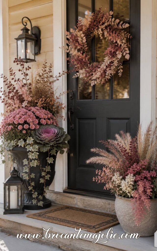
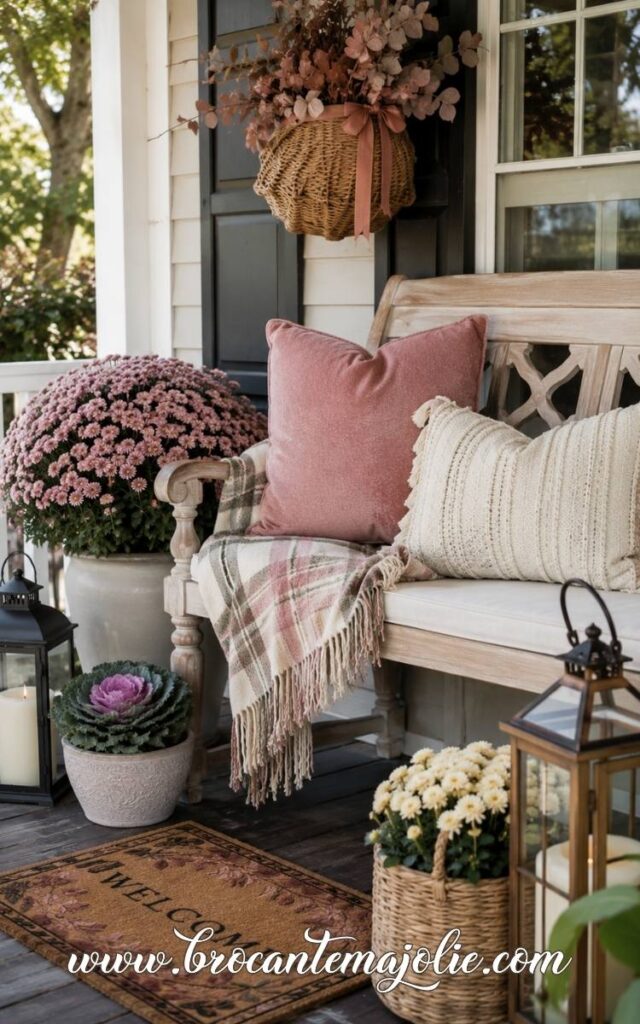
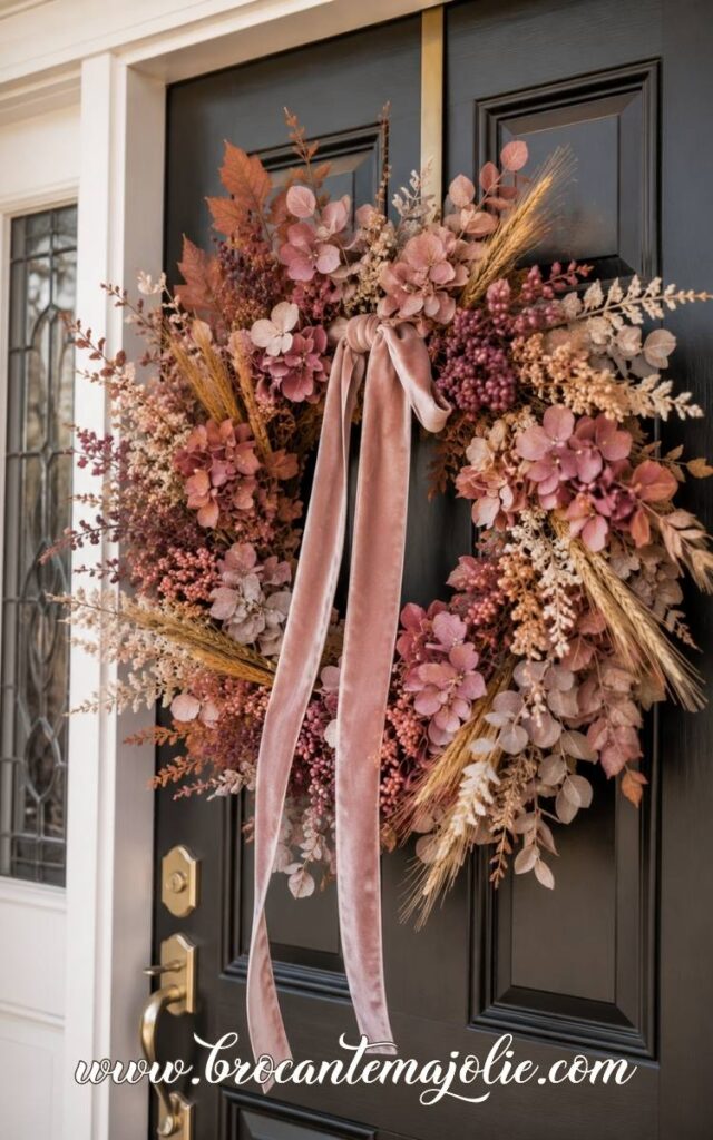
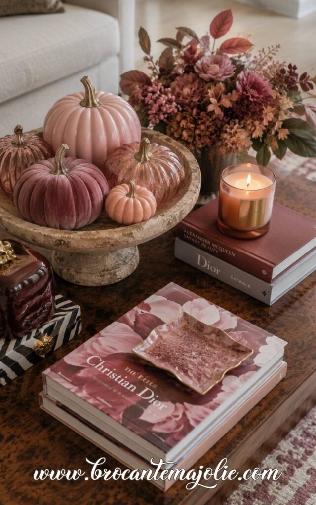
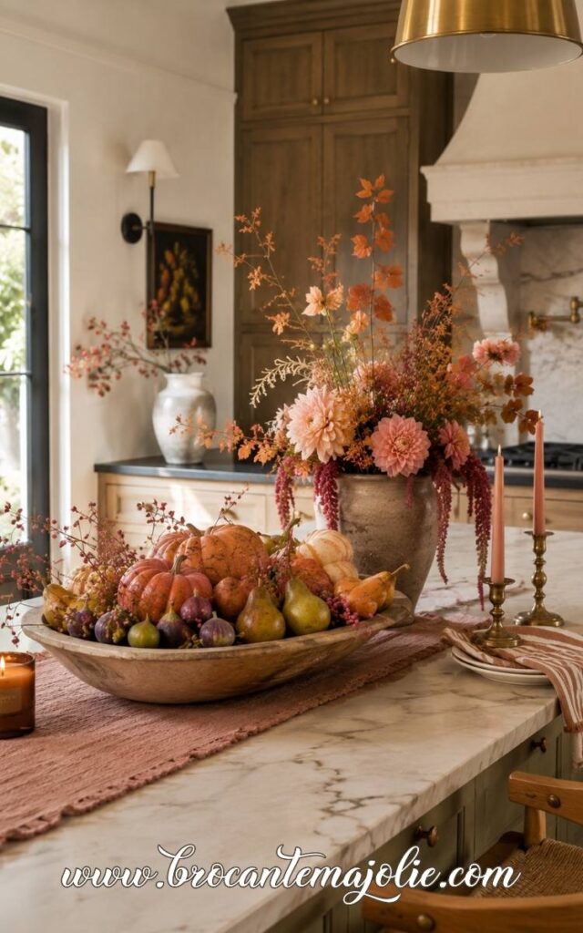
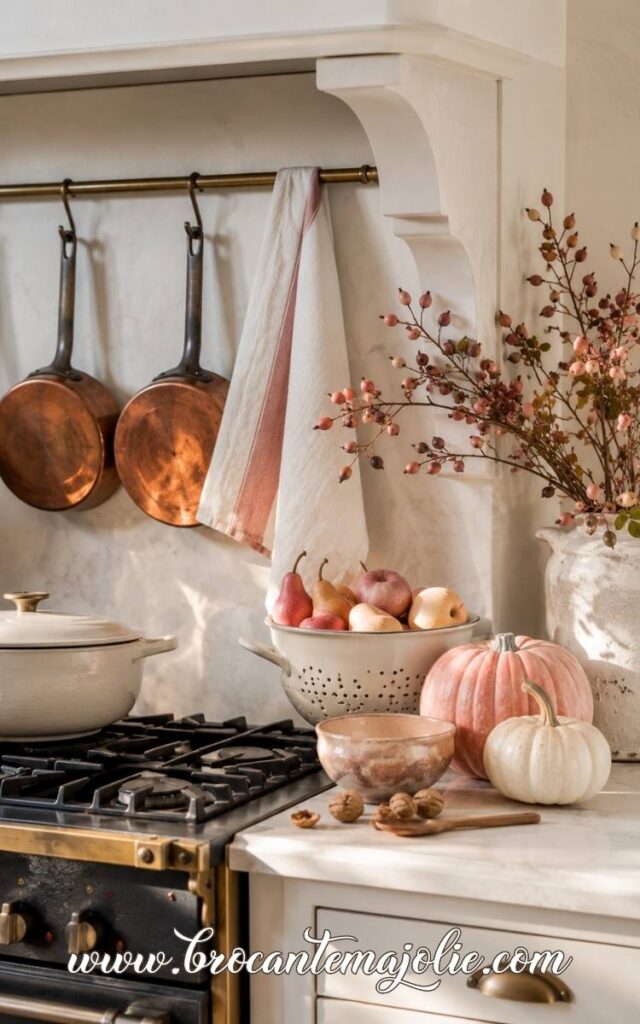
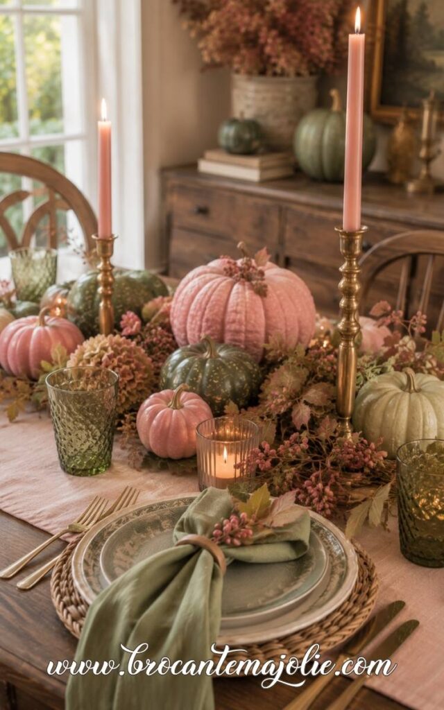
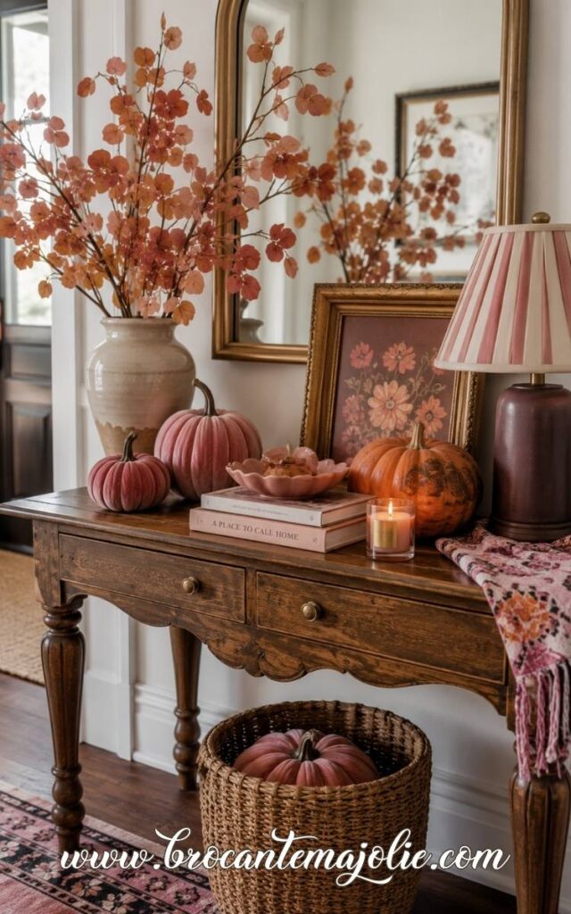
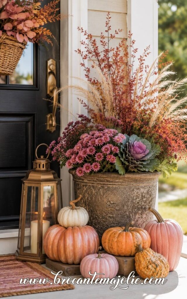
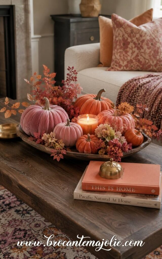
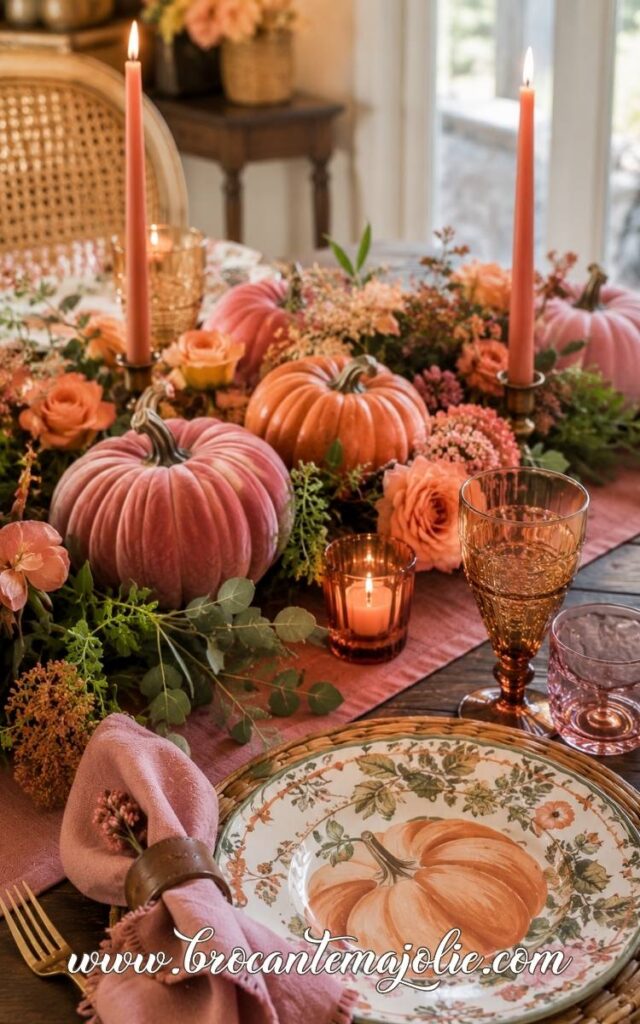
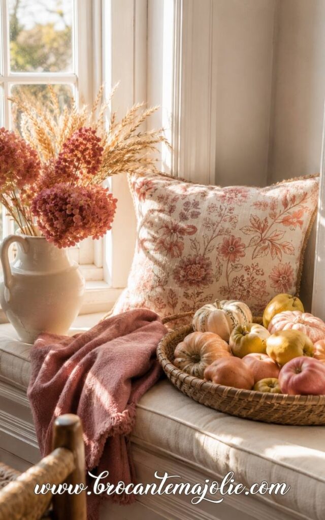
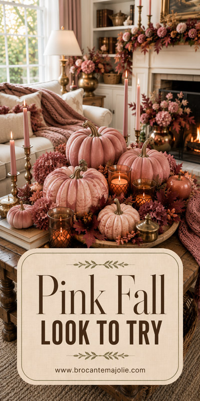
If pink fall decor is your idea of a cozy autumn with a slightly girly twist, you are in the right place.
Maybe you love blush, dusty rose, and soft feminine accents, but you still want your home to feel seasonal and grown-up.
Or perhaps you are simply looking for fall inspiration that feels a little less predictable than the usual orange-and-brown palette.
Pink can be sweet without feeling childish, and feminine without taking over the entire room.
Sometimes one throw, a few pumpkins, a wreath, or a beautiful color pairing is enough to change the mood.
Keep scrolling for ideas you can copy in a bedroom, living room, porch, or even one small corner of your home.
I have provided a direct paid link wherever possible so that you can easily shop and decorate.
Pink fall decor looks best when the color has a clear purpose.
I would avoid using only one shade of pink.
A mix of blush, dusty rose, and one deeper tone gives the display more depth.
They should feel related, but not identical.
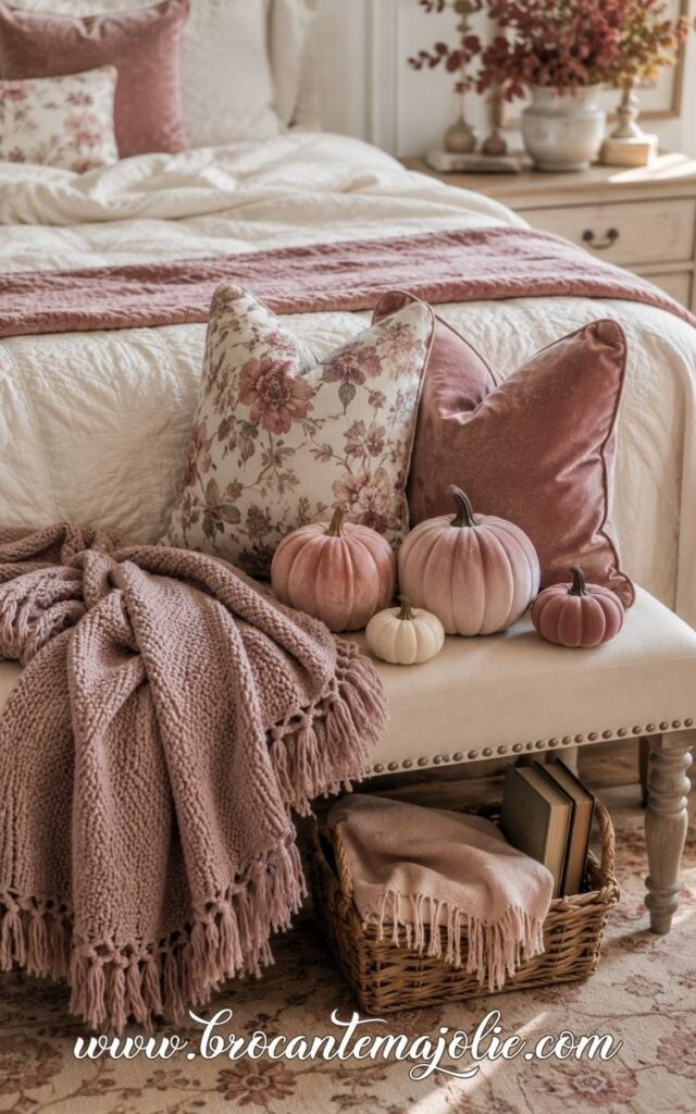
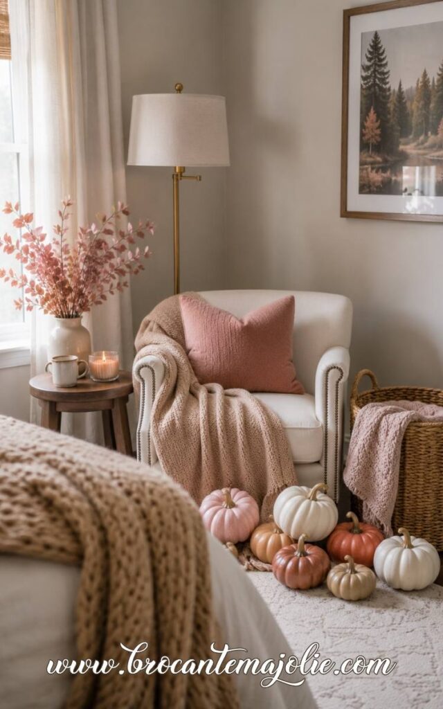
A bedroom already contains plenty of soft surfaces, so pink can become too sweet very quickly.
I would keep the color concentrated in one visual area instead of scattering small pink accents everywhere.
The shade also changes the mood.
Blush feels light and quiet.Dusty pink has more warmth.
Mauve creates depth and works especially well when the room already contains darker wood or stronger neutrals.
Before styling the bedroom, stand in the doorway and notice where your eye lands first.
That is the best place for the main pink accent.
Any second use of the color should sit farther back and feel quieter.
The seasonal feeling should come from the overall balance, not from filling every surface with fall decorations.
Pink feels more autumnal when the room also has visual weight: deeper tones, matte finishes, warm texture, and a little contrast.
This is what keeps the bedroom cozy rather than sugary.
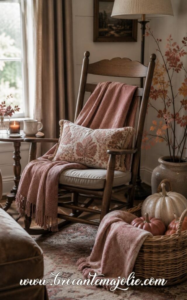
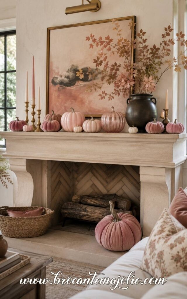
The living room needs a stronger hierarchy because there are more colors, materials, and pieces of furniture competing for attention.
Choose one focal area for the pink.
Let the rest of the room echo it once or twice, but more softly.
I often notice that pink fall decor looks unfinished when the color appears in several tiny places with no real connection between them.
The individual pieces may be pretty, but the room has no clear direction.
Grouping the color creates more impact.
Pink also needs a darker companion to feel right for autumn.
Without that contrast, blush can quickly read as spring decor.
A deeper neutral or richer seasonal color gives it more depth.
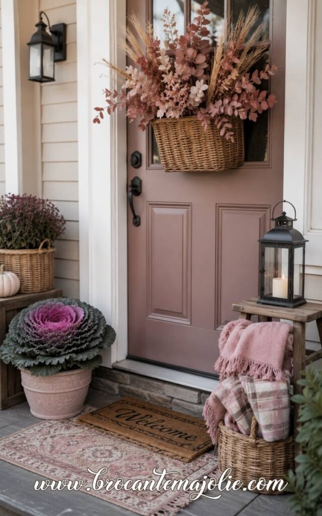
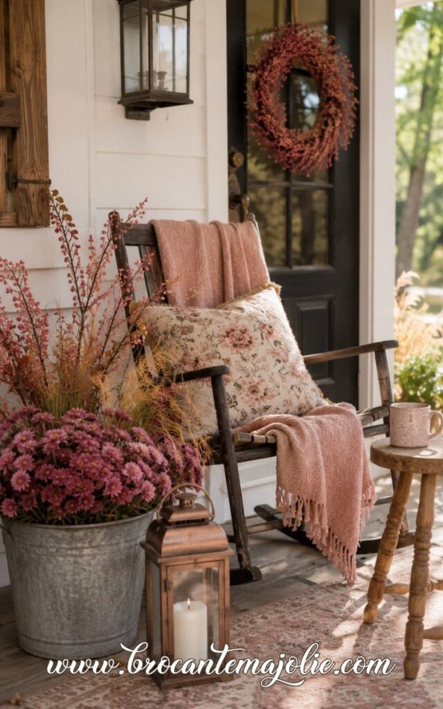
Outdoor light changes color more than most people expect.
A very pale blush that looks lovely indoors may almost disappear from the street.
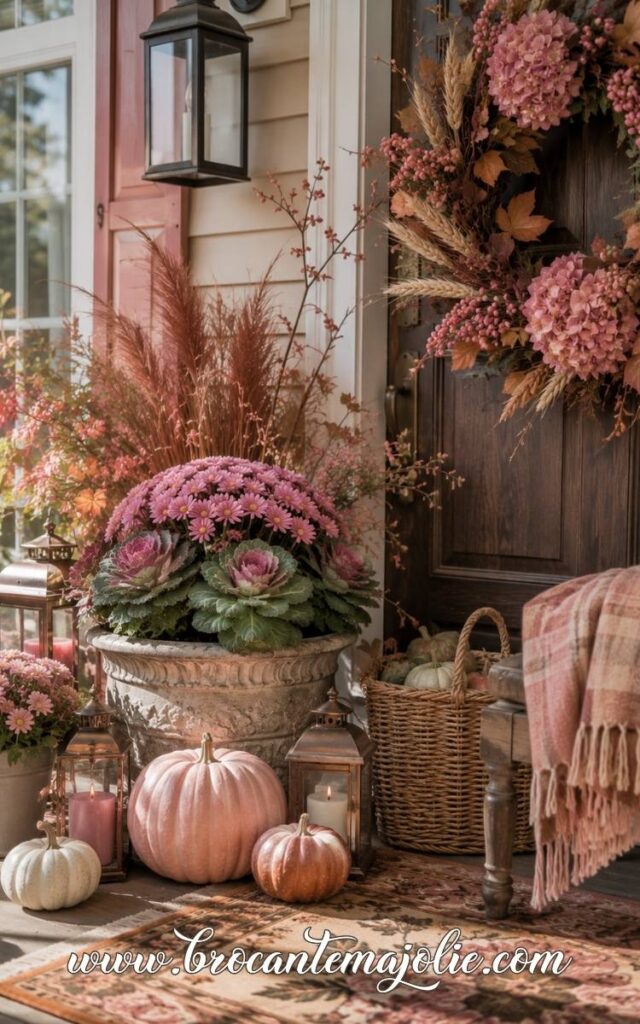
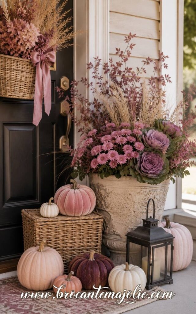
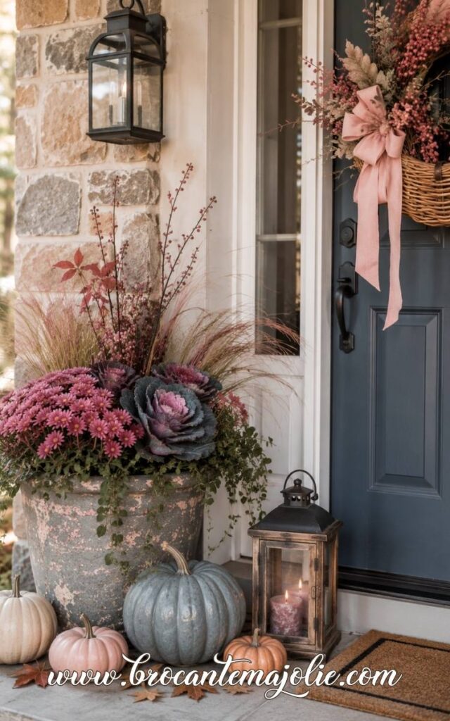
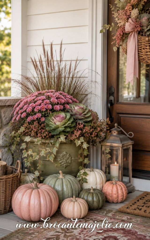
For a porch, I would usually choose a pink one or two shades deeper than the color I would use inside.
Instead of spreading small decorations evenly across the porch, build the display in larger visual groups.
One taller area, one middle layer, and one lower element will look fuller without feeling crowded.
Uneven height is important.
A porch often looks flat when every decoration sits at the same level.
Pink also feels more autumnal outdoors when it is surrounded by colors that already exist in the season.
Olive, brown, burgundy, faded green, and warm cream help take away the spring feeling.
If you are tired of decorating fall the exact same way every year, this guide will help you spot the new ideas that still feel warm and easy to live with.
Pink needs some visual weight around it.
That may come from darker wood, warm metal, dried foliage, textured fabric, or a deeper seasonal color.
Without that contrast, pale pink can drift toward spring.
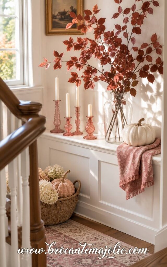
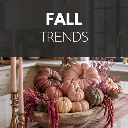
The color beside the pumpkin changes everything.
Cream keeps the look light.
Rust makes it warmer.
Olive feels earthy.
Burgundy gives it more depth.
Even a small amount of brown or charcoal can make blush feel more grown-up.
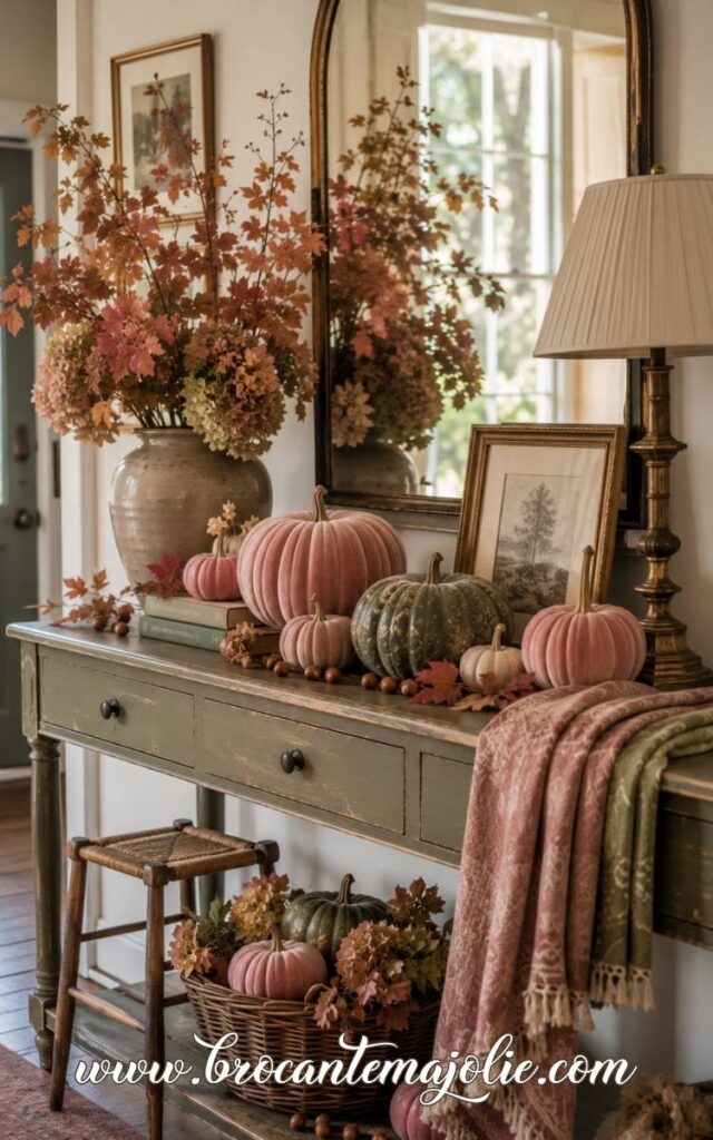
Think about the shape of the surface before arranging anything.
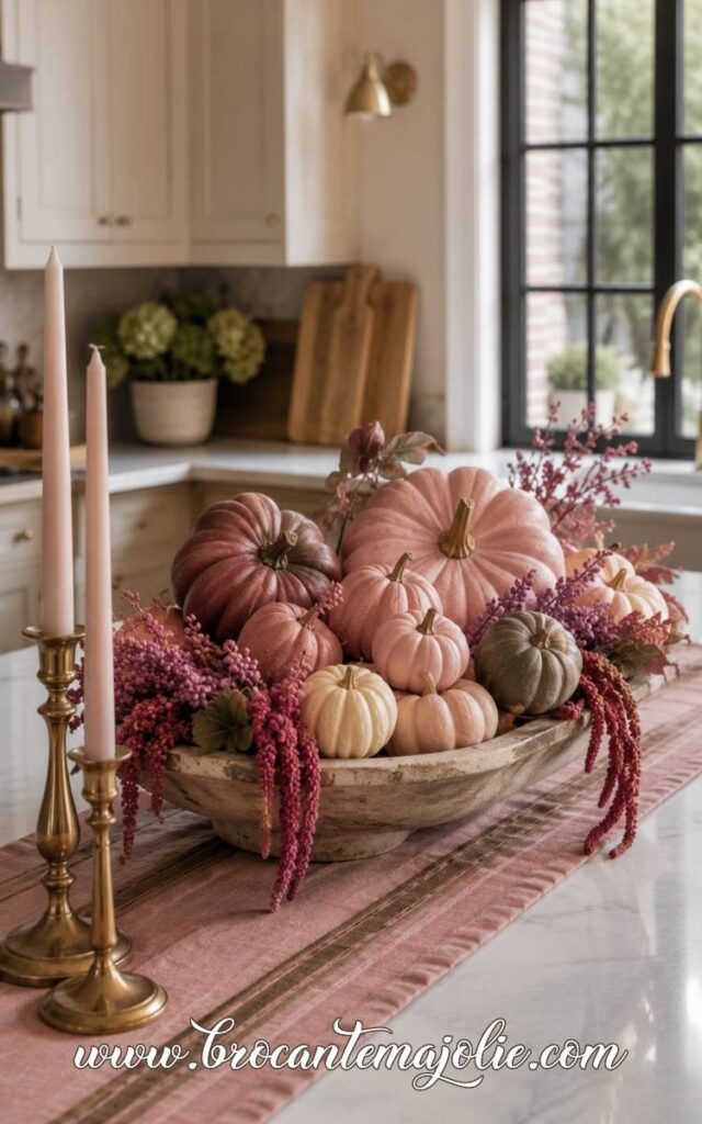
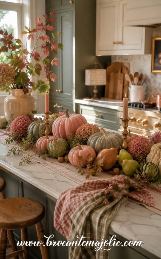
A long table needs a lower, wider composition.
A small round table usually looks better with one compact group.
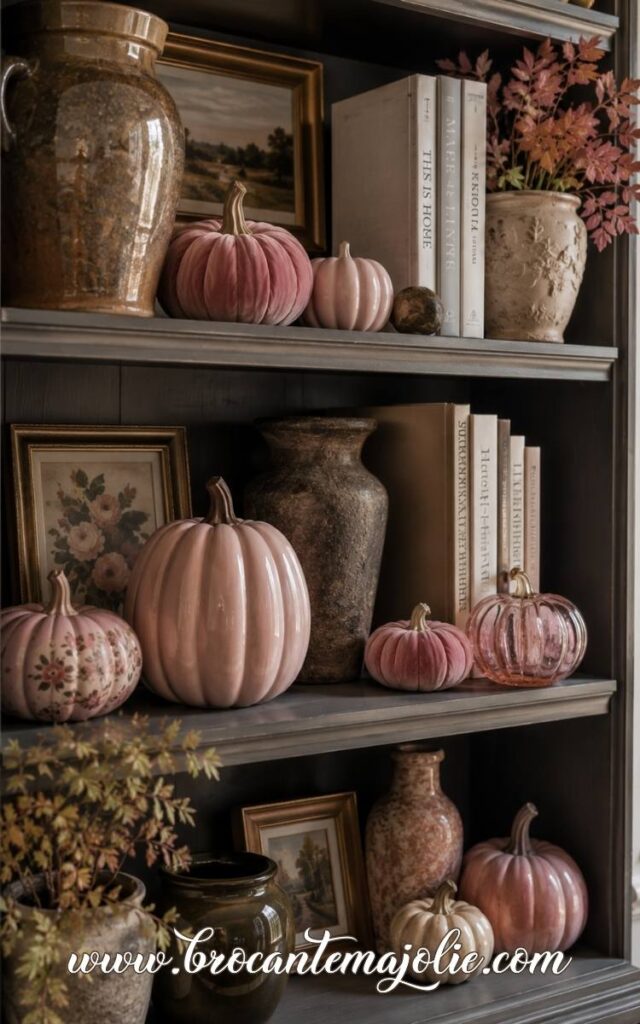
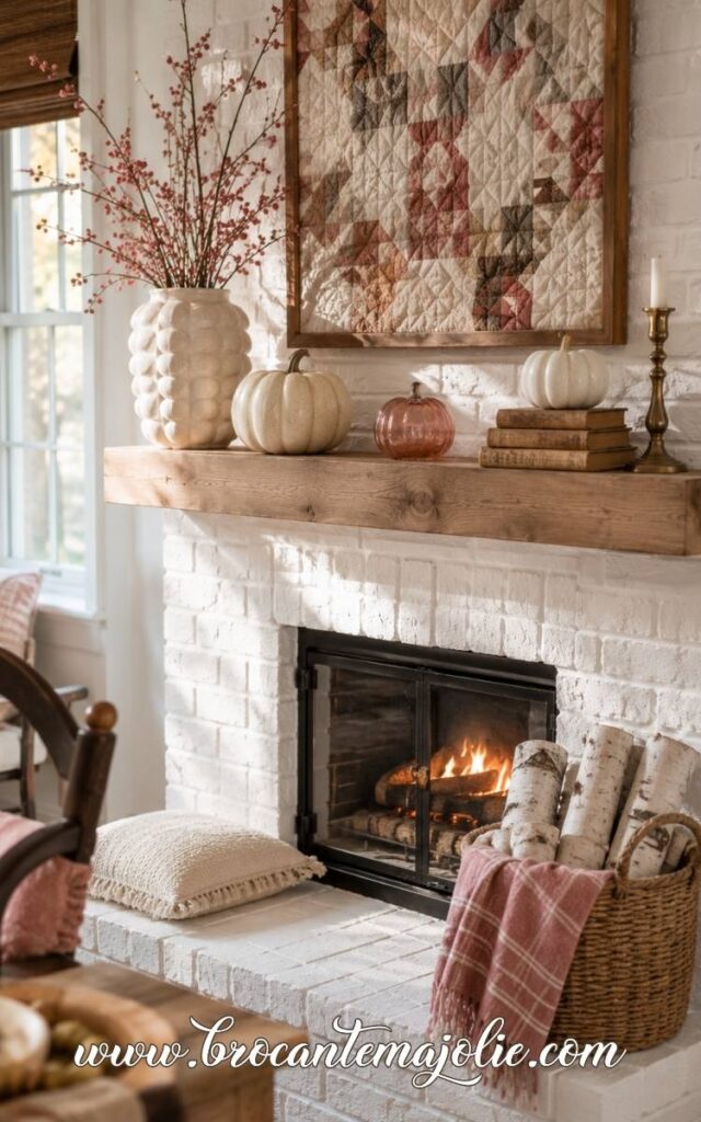
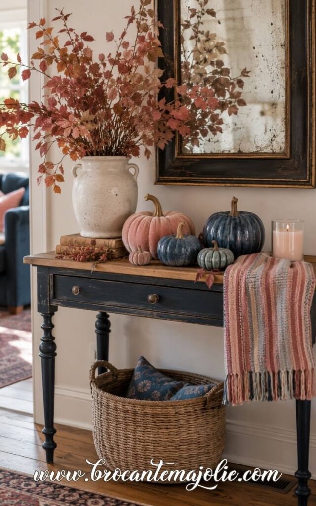
On a mantel or shelf, vary the height instead of lining everything up.
Leave some space between objects.
The strongest displays also include something that is not decorative.
A useful object, an everyday book, a lamp, or a bowl can keep the scene connected to real life.
This is often what stops seasonal styling from looking like a store display.
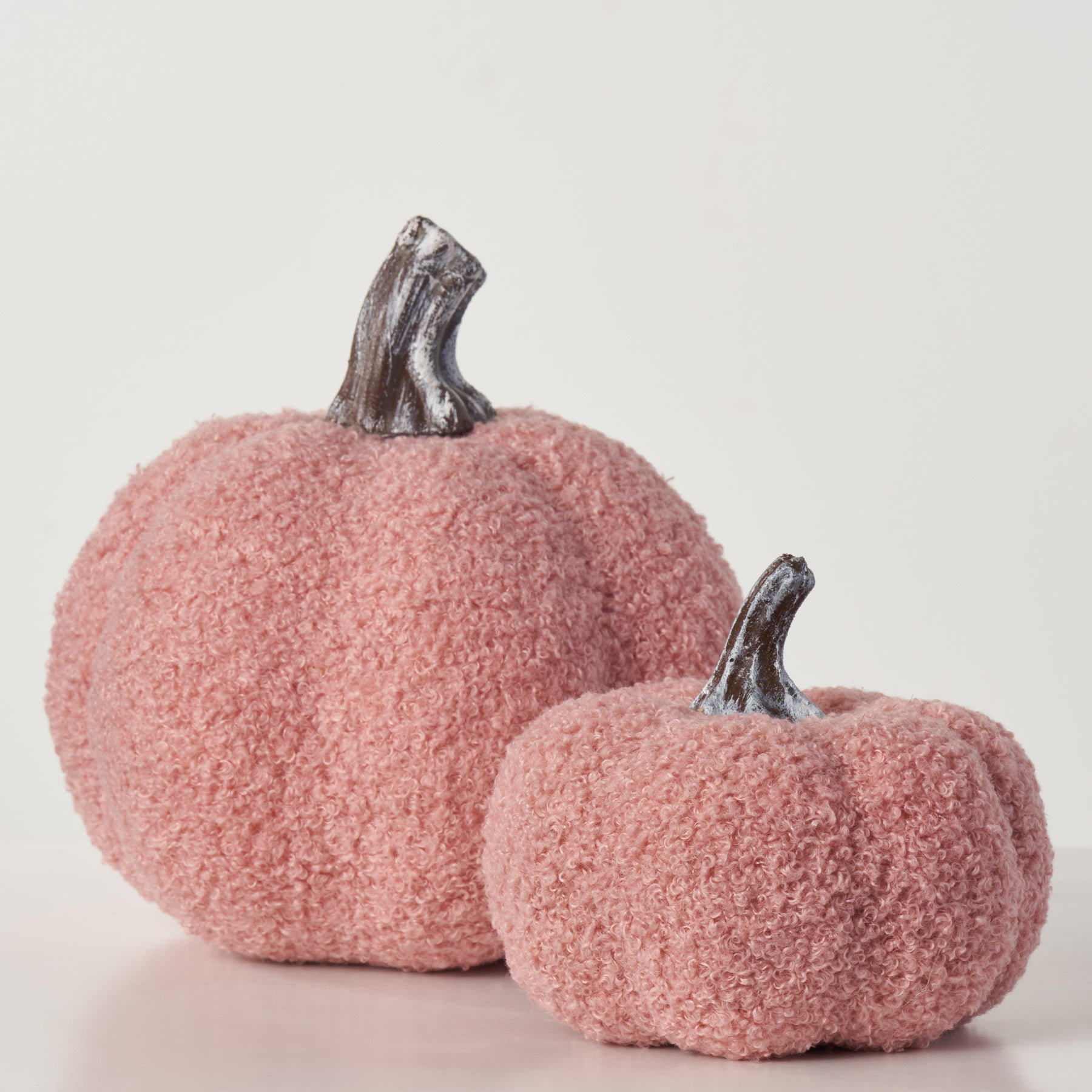
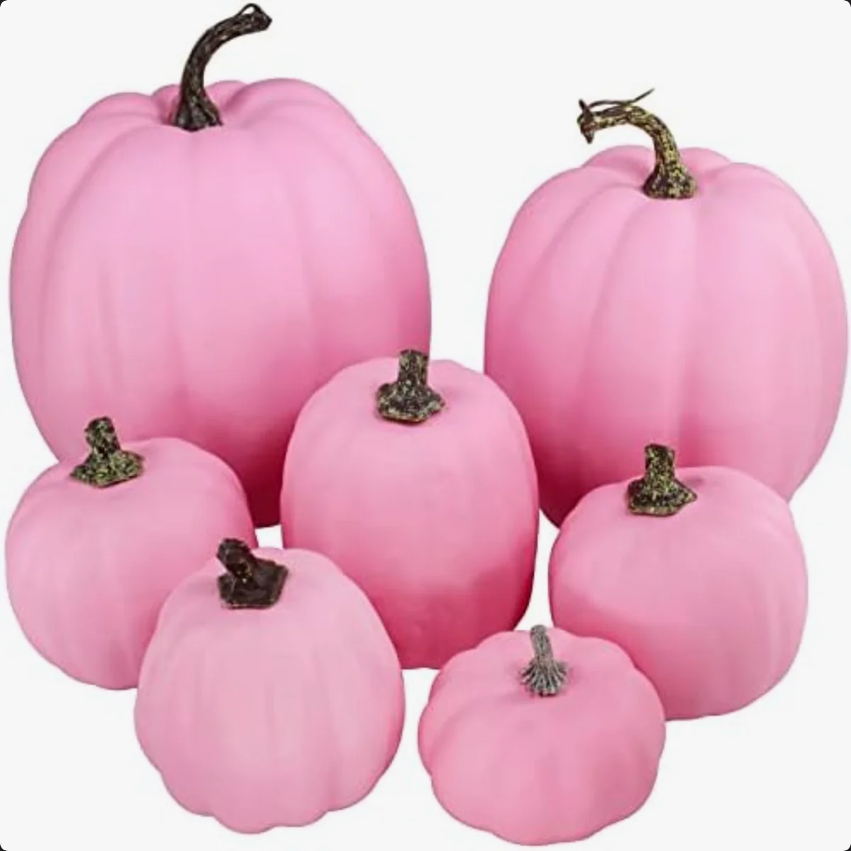
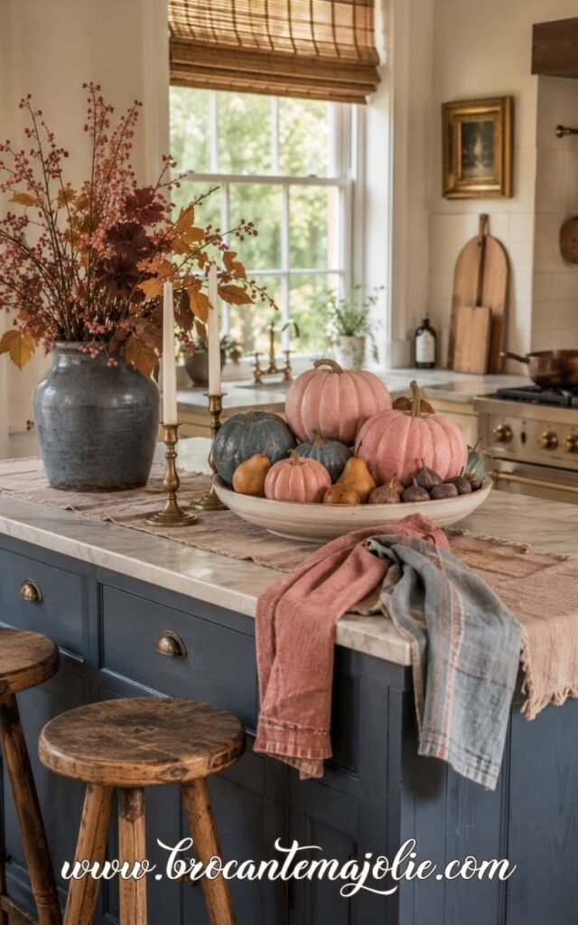
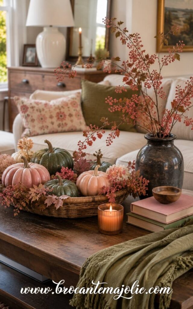
Pumpkins are the easiest fall detail to add almost anywhere, but this trick is making them feel styled instead of scattered.
Pink changes completely depending on the color beside it.
Orange makes it warmer.
White keeps it light.
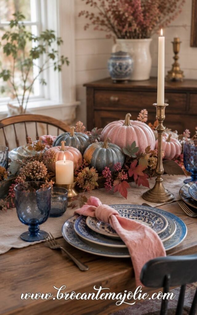
Blue adds contrast.
Green gives it a more natural feel.
The best combination is usually the one that already connects with the room.
This is the most obviously autumnal pairing.
Orange gives pink more warmth, while pink softens the stronger rust and pumpkin tones.
The result feels seasonal without looking too traditional.
Let one color lead.
When orange is already present in the room, pink can be the quieter accent.
In a softer neutral space, pink may take the larger role while orange adds depth.
Warm wood, aged brass, and natural brown help the two colors feel connected.
Without those grounding tones, the palette can start to look too bright.
Pink and white creates a lighter autumn look, but it needs enough contrast to avoid feeling like spring.
The pink should carry some depth.
A mix of pale blush and one darker rose tone keeps the palette from becoming flat.
Use white as the calm base and pink as the detail your eye notices first.
This pairing works especially well in rooms that already feel light.
Pink and blue feels unexpected especially in autumn.
The pairing works best when both colors are slightly muted.
Blue can act as the structure of the room, while pink brings warmth.
That balance is useful in homes that already have blue furniture, rugs, or painted details.
Pink can sit on top of that existing palette without forcing a complete change.
Pink and green feels softer and more organic than the other combinations.
The right green matters.
Sage, olive, moss, and muted forest green all work well for fall.
Pink brings warmth. Green keeps it grounded.
Blush with sage feels calm.
Dusty rose with olive has more character.
Mauve beside a deeper green looks richer and more dramatic.
This combination also works well when the room already includes plants, botanical patterns, or natural materials.
The pink feels connected rather than added on top.
Pink fall decor can feel cozy, feminine, classic, or bold.
It all depends on the shade and the colors around it.
The simplest place to start is with one room or one small display.
Choose the pink tone that suits your home, then repeat it in a few thoughtful places rather than everywhere at once.
SAVE THIS POST FOR LATER
Just hover over an image and click the Pinterest icon to pin it!
French vintage shop
Latest blog posts